Tag Archives: RAG

Postcard Swap

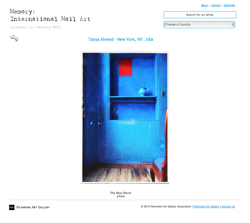
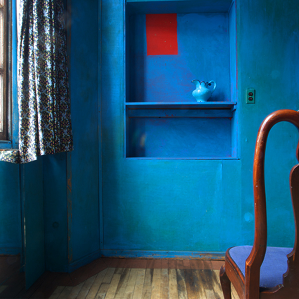
Last year I sent off a postcard of one of my images to the mail art call by Richmond Art Gallery on the theme of memory. You may recall I sent the photograph of the blue room with the red rectangle.

After the postcards had been displayed they were then sent out to other participants in a giant swap. This week I received my swap.

It was a postcard from a photographer called Ronan Considine.

Ronan, was born in Dublin, moved to Canada as a child and currently lives in Vancouver, British Columbia where he works as a travel and landscape photographer.

I asked Ronan about his image…

“That photo was taken when I was traveling over to Asia.  I was flying over northern BC or Alaska.  Im not 100% sure but 1 of the 2.  Just worked out that the sun was setting and the light was just perfect.  The pastel colors and the snow topped mountains were amazing.  And to have a clear airplane window for once was great!”

The first thing that I thought when I received Ronan’s postcard was that the blue colour palette matched the photographs I posted last week. My post about cyanotypes and Teddy’s curlers. It seemed like destiny for me to receive Ronan’s postcard! The second thing was that I wasn’t sure if it was a photograph or a painting, the colours were so delicate and pastel. I hadn’t seen anything like that before and really had to study it. Remarkable!

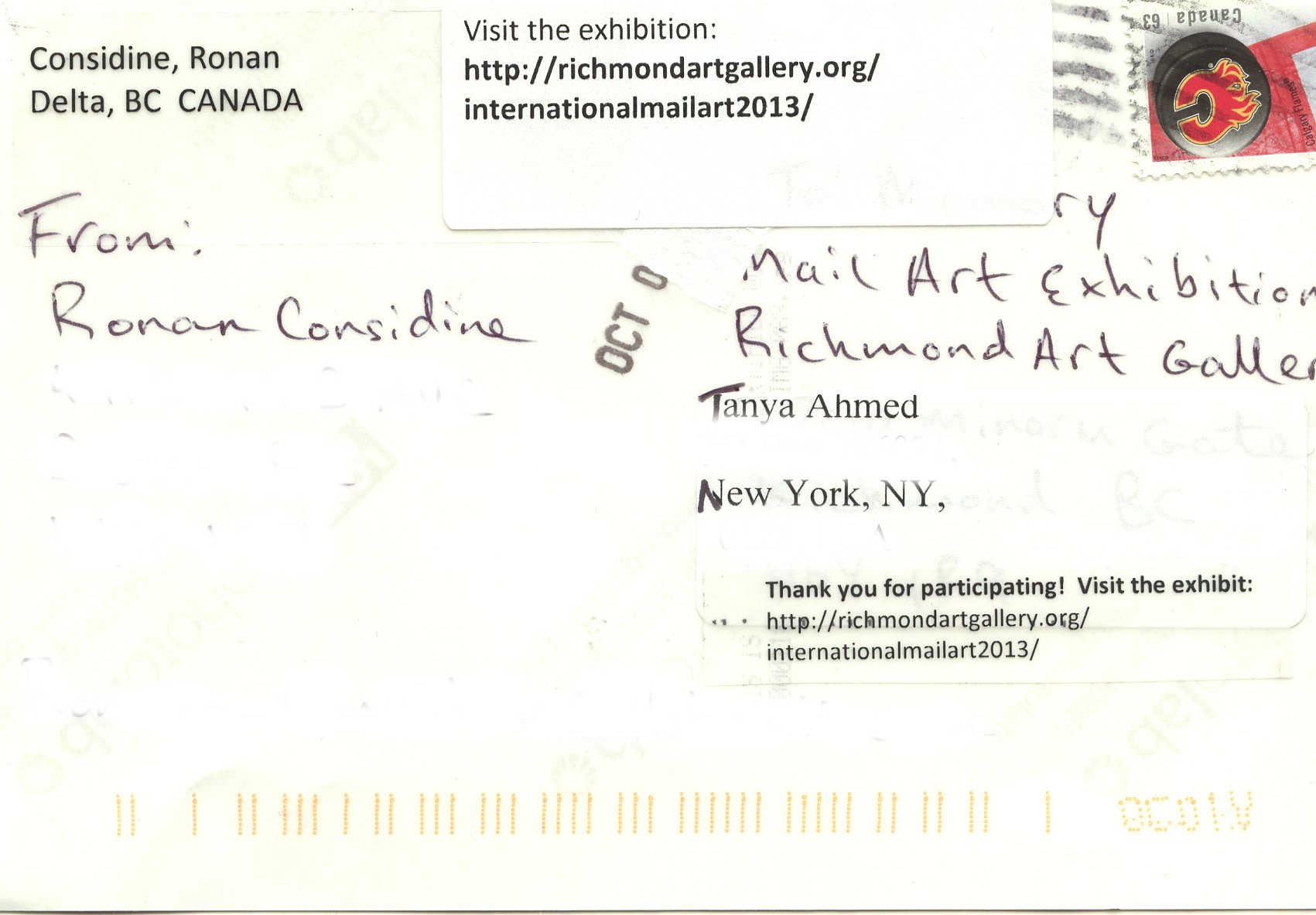
The back of the postcard was interesting too, having been in the mail twice, so I include both sides of the postcard below (street addresses removed).

Photograph copyright of Ronan Considine, used with permission.

RonanConsadineMemoryRichmondArtGallery


RCpostcardback

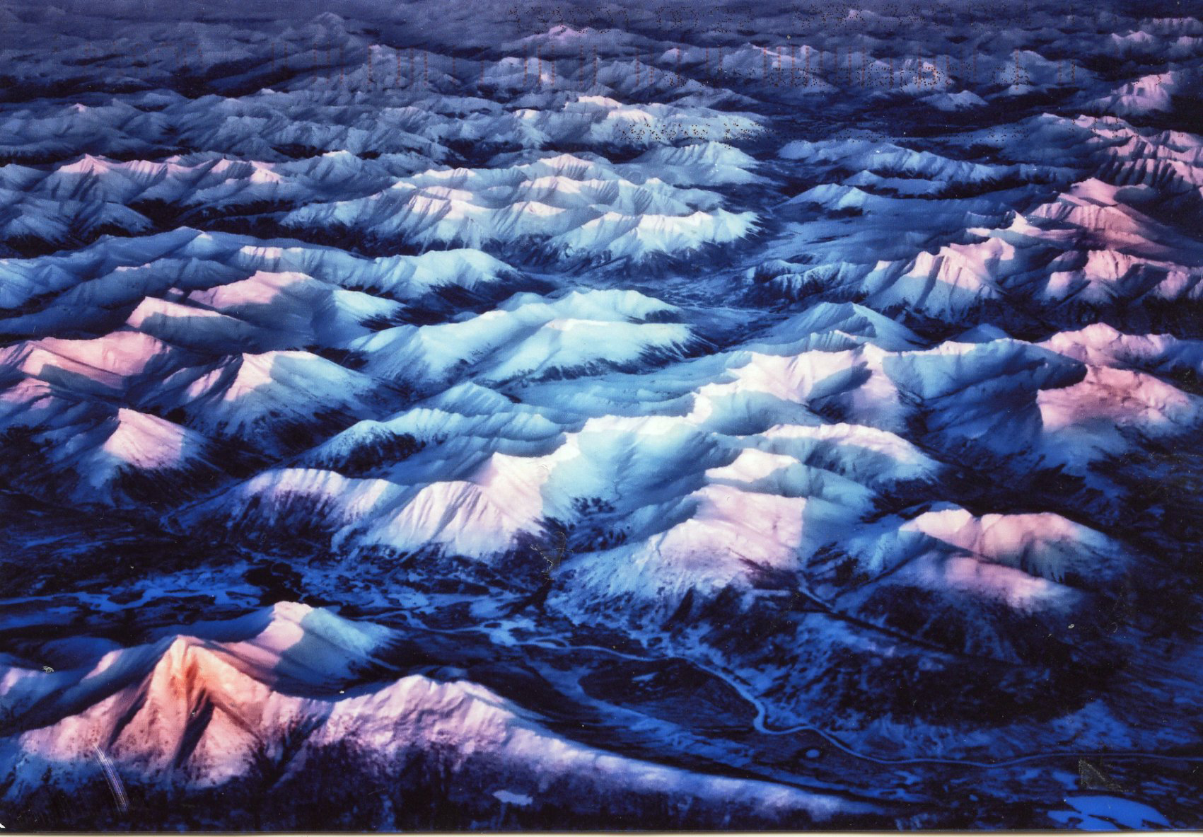
Thinking about Ronan’s image brought to mind one from the archive- a view over Afghanistan. Ronan’s mountains have a softness that disguises the formidable landscape and presents a beautiful vista. The lovely light, slightly surreal with its pale pink and blue hues, is what transforms his image.

AfghanistanTanyaAhmed

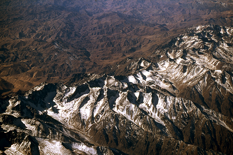
My photograph over Afghanistan is bare and much less romantic. The sunlight catches the near peaks and the sprinkling of snow brightens, but fundamentally doesn’t alter, the impression of monotonous brown rock. The terrain is rough and endless. I know people live and travel over this mountainous region of Afghanistan. Maybe they travel over the peaks in Ronan’s image too. One image though reminds me of subsistence living and the other of feted explorers. I wonder how my photograph would have looked if I’d flown over at sunset?

All this talk of mountains also made me think about the Sinjar Mountain range in Iraq and the Yazidi refugees, no snow there, temperatures in the 90s, not romantic and not subsistence either, just desperate.

http://mashable.com/2014/08/11/eyewitness-iraq-yazidis-rescue/

It was great to receive Ronan’s postcard and discover his work. If you’d like to see more check out these links:

Ronan’s website http://www.considinephotography.com

Ronan’s facebook https://www.facebook.com/considinephtotgraphy

UPDATE.

I just got an e mail off Kathy Tycholis from the Richmond Art Gallery explaining the process of teh postcard swap…

” I don’t think people realize why this “swap” takes me so long when they first submit to the exhibition.  I get a few complaints from people who have to wait too long for their returned cards, but the reason is because  I do try my very best to match people whose works I think speak to each other in some way.  Not everyone may agree with the swaps I choose for them, and it is definitely subjective on my part…but I do try very hard to make sure both artists are happy.  I’ve done a lot of swapping for shows like this, but having just so many this year was pretty overwhelming.  (and in case you are wondering…yes, it is just me alone that does all this, I don’t really trust anyone else to “help” me)

So to hear your feedback is VERY rewarding, makes me feel good…  I think I chose the work based on colour and mood.  Very happy that the works do speak to each other so well.  Thank you for this, really made my day!”

and then I got one off Ronan… I finally found them (postcards) today and to my delight I saw that I got one of yours!! I don’t know if they did that on purpose or not but it was a real delight to see you name on one of them, and to tell you the truth by far my favorite one! The photo is titled “Blue Room”  And yes it has a same color pallet as my photo 🙂  I love the red square in it just jumps out with great contrast. Great shot!”

I feel like I have two new friends and photographic colleagues, all from a postcard 🙂


Richmond Art Gallery

Richmond Art Gallery Mail Art Exhibition and Swap.

http://richmondartgallery.org/internationalmailart2013/

1300 artworks were shown in this mail art exhibition that included 1 of my photographs. I didn’t see the exhibition as it was in Canada, but it is now online.

I discovered that my photograph was featured right under the headline of the show, you can see it, via the link, in situ, in the third photograph, under the show’s heading: Memory: International Mail Art Exhibition and Swap. It is so cool to be able to see all the other pieces and you can search by country or name to get a closer look. I wonder which one will be my swap.

Here’s my image as it appears if you search under my name, but click through to the website to see the installation photographs and search out other artists’ work.

TanyaAhmedMemoryRichmond Gallery

Art as Therapy

Art as Therapy – Book

I thoroughly enjoyed the book ‘The Architecture of Happiness’ by Alain de Botton and when I saw his newest title, ‘Art as Therapy’ in my local bookstore I knew I had to read it. The book questions the way art is presented, amongst other issues. One concern is how we might understand and enjoy more of art if it wasn’t labelled by the artistic period, historical journey or style, and other information that assumes we have a prior knowledge or interest in art history. De Botton speculates as to whether we could connect with art more if its positioning took advantage of our everyday understanding and feelings. De Botton is going so far as to actually engage several museums and he will reorient, reclassify and relabel works of art. Unfortunately this will not be local to me, so I will have to hope for a web or print presence later.

There are of course several examples in the book but one really struck me. I am not much of a fan of paintings of the ‘Madonna and child.’ The plethora of such images and the religious tone, has always prevented me from even bothering to look at these works. The painting discussed is called ‘Christ appearing to his mother, 1496’ by Juan de Flandes, you can see it and read the label that accompanies it here… http://www.metmuseum.org/collections/search-the-collections/437489  Not exactly scintillating prose it is?

De Botton’s suggested label talks of the history of the relationship of the subject with the world and this shocking encounter with his mother. It runs to four paragraphs the last of which says… ‘The picture makes the claim that such moments of return (and survival), though fleeting and rare, are crucially important in life. It wants men to understand- and call- their mothers.’(de Botton, 2013) It’s on page 91 of the book if you want to check it out in its entirety.

After I read this I looked at the painting once more and because I had emotional information to go on I found it easier to find a connection. It tapped into my role as a mother. Could I see the things suggested in the image? Could I feel the emotions now I understood the history of the relationship pictured, rather than the location of the painting? Could I now connect with the art? One half of me feels that perhaps if I wasn’t such a simpleton when it comes to traditional art I wouldn’t need to be so forcefully led to even think of really looking at this image. Everyone knows that if you have to read the label you are not looking at the work carefully enough. The other half of me acknowledges though that art is for all and what is  the point of people going to the museum and not being able to really interact mentally with what they see or even worse not going because they lack a scholarly intellect.

De Botton explores seven functions that he assigns to art. These are the things that art can help us with. In other words art’s function is to help us explore and deal with these issues:

Remembering, Hope, Sorrow, Rebalancing, Self Understanding, Growth and Appreciation.

Whilst I generally agree that art can do this and in fact does this for me through my own photography I am perhaps leery of the idea that art can be clearly categorized under these labels. Which is what de Botton intends to do in the upcoming museum curations he will do. Who is to choose what quality each artwork carries? I may look at an image and be filled with sorrow whereas you may look at the same image and be full of hope. Does this mean that the artist’s work is not good, if it is not clear enough to be read by the viewer? Maybe. It could be though that we bring such cultural baggage with us that we may not recognize work from different cultures or times or in fact our own life experiences and concerns may just be pull us in a different direction from other viewers looking at the same work.

I recently asked for comments on several photographs of mine hoping to validate my experience and reason for making the image. Looking at them without any outside information I found that observers are just too individualized to all have the same reaction and in fact the participants had very different thought processes, life experiences and therefore reactions to each image. I also found that specific colors and lack of a human presence triggered specific cultural responses. Simplistically put for this image as blue equals sad and empty means lonely.

The image below carried negative connotations for some , one made a witty comment and a couple understood the meditative aspects of the spaces pictured as being positive. As de Botton noted in ‘The Architecture of Happiness’ ‘We seem incapable of looking at buildings or pieces of furniture without tying them to the historical and personal circumstances of our viewing; as a result architectural and decorative styles become, for us, emotional souvenirs of the moments and settings in which we come across them.’ (de Botton 2006). Applying our own set of experiences can from one person to another twist the emotional response.

Here is my photograph and below a few of the comments it inspired. How do you feel about this image?

TanyaAhmedBlue


Abandoned emptiness, I leave
in a hurry, to escape
the blueness, the anger, the hopelessness of my soul.
I sit alone
staring out of the window
hoping for a freer life.
I’m gone, no longer stuck
in the blue room of my mind.
I’ve left behind what isn’t mine. (Alison)

When I returned, he’d stripped my yellow room and daubed it a vicious blue. He’d gone, but he’d walked his paint all over the house. Even now, months later, I find his blue fingers stuck to a shelf, flicking through a book, crawling under my bed.  (Brenda)

I’ve gone to get a life now.  Goodbye loneliness, goodbye emptiness, goodbye monotony.  Hello world — here I come!  (Evangeline)

To me it recalls Van Goch’s painting of his bedroom in Arles: the intense colours, the floorboards, the chair. The walls may not be yellow, the shelves are empty and the jug has no flowers. There is no inhabitant here now but maybe his inspiration remains.  (Nicholas)

Why oh why
did I not buy
that second tin of paint ? (Dick)

Grandma’s Jug

Her brushes have gone

and her empty jug awaits its fate.

The paint encrusted carpet has been taken

like her.

Away.

The tell-tale smell of turps still lingers in this blue,

blue room,

singing silently of hours at the easel.

She will wither away

in the pastels

of that place. (Denise)

When I look at this picture I see red. A study in scarlet, a drop in a turquoise ocean. (‘Will all great Neptune’s ocean wash this blood clean from my hands? No, this my hand will rather the multitudinous seas incarnadine, making the green one red.’)

The surrounding blue is an extraordinarily intense combination of azure and turquoise – an essence of the Mediterranean and North Africa. I think sitting in the room would be a form of colour therapy – I imagine being bathed in the intensity of colour, with the life force seeping down to my bones and warming my blood.

I wonder who painted it those colours. Was it their escape from a grey outside world – a rich, jewel-coloured cocoon, a place of respite and recovery?  (Eileen)

This photograph is currently featured in the exhibition;

Memory: International Mail Art Exhibition and Swap
Coordinated by Kathy Tycholis at the Richmond Art Gallery, British Columbia in Canada. An online gallery of all the works will be up in January.

http://www.richmondartgallery.org/mail-art-2013.php

Armstrong, John and De Botton, Alain, 2013, Art as Therapy, Phaidon Press, New York