December 2013

A Year (and a bit) On

A Year (and a bit) On

The Museum of the City of New York does a great job with educating through its exhibitions. Rather than just displaying artifacts, the exhibitions are often themed and have panels of information rather than itty bitty labels.

Still, though, when I heard about a photography exhibit I got it into my head that it would be different. Something pretentious in me assumes I have no need for words as I understand photography in a way that I don’t with other subjects. Of course though the exhibition wasn’t really about photography at all, it was about an event that we got to share physically as New York residents and then re-share with others through the medium of photography. The panels provided sobering figures and information that amplified the effect of the photographs.

The Museum put out an open call to professionals and amateur photographers and got a response from 900 photographers who submitted around 10,000 images. I was one of them but sadly not chosen. In fact there were such a small amount chosen that a second selection was culled and put outside the main gallery on a video loop so that another 400 images could be viewed.

So, what was it all about? Hurricane Sandy. The exhibition was opened at the one year anniversary and detailed the event through six sections Storm, Destruction, Coping, Home, Relief and Not Over.

Opening just days before Hurricane Yolanda/ Haiyan, which was a stark lesson in the difference between first world and third world infrastructure and response, the exhibition none the less covered many of the same shared experiences.

With areas of New York burnt, flooded and blacked out there were many photographs taken by residents who used photography as a way to process, prove, preserve and share the unbelievable events happening around them.

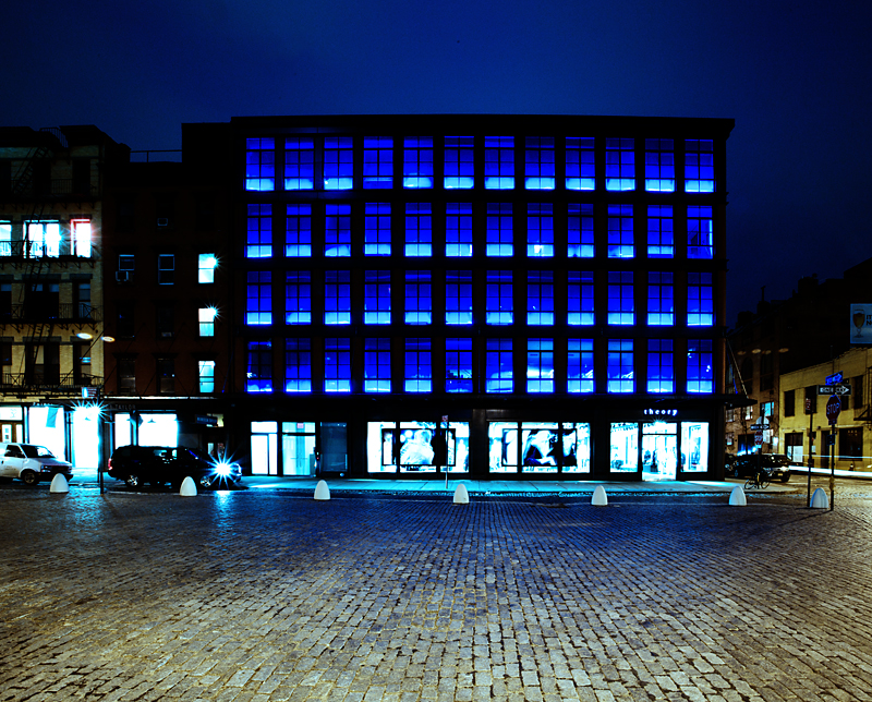
Of course there were many stunning images of waves, cascading waters, floating cars and destroyed houses but what struck me were some of the images of after the storm had passed through. The photograph outside of Fairway supermarket with shopping carts tightly packed together, full of useless food and the inside of another store where the dairy shelves were bare because there was no electricity and therefore no way to keep fresh food. The No Gas signs, cutting people off from travel or escape and the iconic views of Manhattan, half erased in the blackout gave a deeper look into the far reaching consequences of the storm. Many of the images were of people planning, organizing and helping each other, engaging in recovery and these brought the attention from images of nature’s power back to the sympathetic human level.

Frightening really to think that a bit of weather blows through and modern New Yorkers are left without shelter, food, power or gasoline.

The exhibition was less a show about photographic skill, although there was much evident, and more a tale of a city’s ongoing response to adversity. There was a small section on the use of cell phone photography, the everyman photojournalist dispersing images. I remember watching a steady stream of cell phone images on the local new station NY1 as New Yorkers tracked and shared the storm’s path in real time. The way people used photography was interesting too, a large scrapbook by a Rockaway’s resident, professionals made series, residents shot out of their windows, some photographs were official documents, some photographs were sad but others captured fun, I am thinking of one image, taken I assume as the storm approached, of a small group of people feeling the wind blow on them, their bodies pushed backwards, their arms and hair up in the air, enjoying the awesome power of nature and demonstrating the folly of the young in thinking that they are invincible.

I took a few photographs too as the storm passed over. In my neighborhood the East River spilled over, drowned the FDR highway and turned First Avenue into a raging river. We watched as the surge came up the Avenue, drowning cars in its path and entering buildings. Our building was lucky, thanks to some quick moving by residents to barricade the entrance. The water got into the building but didn’t get into the elevators or electrics, unlike some less fortunate buildings who lost power after they got waterlogged. The FDNY stayed ahead of the flooding on scene to assist motorists who couldn’t  get away fast enough.

I had a few previously booked days off so had the time and could have gone on to take further images but I wrestled with the idea of it. Spared from ongoing damage by living uptown I struggled with the idea of going downtown or to the other boroughs to take photographs of the misery of others. Especially when  the images I took would not be used in any informative capacity, ie by the press or other official capacity but would merely be portfolio pieces. In effect I’d be a disaster tourist. I decided not to do it and in fact one of the great things about this exhibition was that many of the photographs were clearly taken by people, amateur and professional, acutely affected and resident in the communities they were documenting. Taking it like it was.

Museum of the City of New York  http://www.mcny.org/exhibition/rising-waters

Twitter #risingwaters   https://twitter.com/search?q=%23risingwaters&src=hash


ˈfōtō ˈfôrtˌnīt frīdē

Theory (Clothing Store)

This building, in the Meatpacking district at the crossroads of Gansevoort Street, Little West 12th and Ninth Avenue, is a new building built in a turn of the century (last century!) style.

TanyaAhmedTheory

DPRK; Delete!

DPRK; don’t mess with us or we’ll delete your photo.

Earlier this year the Metropolitan Museum of Art hosted two exhibitions.                    One was ‘ Faking it. Manipulated Photography Before Photoshop and the other was ‘After Photoshop. Manipulated Photography in the Digital Age’.

Large, informative and very interesting shows and of great relevance today as the establishment tries to define what is acceptably manipulated in a photograph that tries to offer a truth of what it represents.

Of course photographs generally do not come out of the camera ready. As the photographer Edward Steichen said in 1903 “Every photograph is a fake from start to finish, a purely impersonal, un-manipulated photograph being practically impossible.”

Negatives would be printed, sandwiched, manipulated, and prints collaged, and digital raw files get a handful of ‘tweaks’ and are saved as a different file altogether. Sometimes the treatment is obvious, sometimes not. Let’s not forget that the photographer in composing the image chooses just a minute portion of a much greater scene thereby determining a highly selective point of view.

Generally I am a tweaking, but keeping it real, type of photographer, but also believe that if you want to be ‘arty’ within or even on a photograph, then why not? When I approached some of the photographs in the exhibition though it became a question not of what and how but of why. It was with some questioning that I came upon the images of Stalin where people who had been in a photograph with him, after falling out of favor, were removed from the image.

[Kliment Voroshilov, Vyacheslav Molotov, Joseph Stalin, and Nikolay Yezhov on Moscow-Volga Canal, Moscow]

http://www.metmuseum.org/exhibitions/view?exhibitionId=%7b36D81705-241D-4934-AB02-FD7C8DBBB3E5%7d&oid=294848&pg=3&rpp=60&pos=158&ft=*

[Kliment Voroshilov, Vyacheslav Molotov, and Joseph Stalin on the Moscow-Volga Canal, Moscow]

http://www.metmuseum.org/exhibitions/view?exhibitionId=%7b36D81705-241D-4934-AB02-FD7C8DBBB3E5%7d&oid=294849&pg=3&rpp=60&pos=157&ft=*

Being a fan of the author George Orwell and his book 1984 I recalled his words as I viewed history photographically rewritten by the Soviets. But hey this was a long time ago. Photography was fairly new and maybe they hadn’t thought through the fact that photographs are eminently reproducible and distributable and therefore an old and a new copy might surface together in the future, as they have done here in the Met. Maybe it only mattered in their present and they thought the archives would reflect what they kept. Perhaps also they thought they would remain in charge of the archives.

It seems odd to think that they thought they could get away with this alteration of already dispersed photographs. When I saw the photographs at the Met they were from such a long time ago, and a now defunct system, that they seemed really to be irrelevant to the issues we face today with alterations happening before we see images, rather than after they have entered the public space.

You can imagine my surprise then when I was confronted with the same issue in recent news reports. With the sudden execution of North Korean Chang Song-thaek, the Uncle of the country’s leader Kim Jong-un, the regime has begun to rewrite history just like the Soviets did by erasing the image of the executed uncle from photographs.

Today is 2013 though, now we have the internet and all the world can see that the original images have been tampered with and the narrative adjusted. We are visually familiar with the Uncle from his years accompanying Kim Jong-il so we can’t be persuaded that he was not a part of the North Korean leadership. I don’t understand why these images have been doctored, they do not erase the fact of the man.

We can of course not be quite sure that it isn’t some sort of conspiracy – by the West or North Korea or even just an individual because everything we hear reported from North Korea just sounds so odd that it can be hard to understand whether what we hear is truth or propaganda.

But if it is true that the regime is having people removed from images do we think that the North Korean people don’t know this? Does the North Korean leadership think that we do not recognize this? If people are aware that these images are being tampered with doesn’t this make the regime look a bit ridiculous?

There are many ways of removing people from photographs and the images we are shown in the Guardian newspaper show us a few of these. The easiest way is to crop the image and I think this is a perfectly valid way of getting rid of someone without lying!

Have you fell out with someone and torn a photo of you and them in half. You tossed the half with the other person and kept the image of yourself. All you have done is re-crop the image. You still inhabit the space you did however, through losing the material, you make the visible space smaller and therefore have a smaller angle of view. In fact there is even a frame for a newly torn image available by mail order…

droppedImage

This close cropping has been done with some of the North Korean photographs. Others have been replaced with images from the same event where the photographer has chosen a different angle so the offending Uncle is not in the image anymore. Some of the drama the Guardian newspaper is trying to create is really quashed as I find these valid ways of showing the truth, all be it in a more narrow way. Just moving your camera one way or another doesn’t alter the truth it just pertains to a different portion of it.

What I don’t understand, and what gives the article its credibility in reporting that something strange is happening, is in the photographs where it is obvious that the image has not been cropped at the edges, nor the scene taken from a different viewpoint, but where the uncle has been erased from the middle of the image.

http://www.theguardian.com/global/gallery/2013/dec/09/kim-jong-uns-uncle-vanishes-from-documentary-footage-in-pictures?search=Kim+Jong-un%27s+uncle+vanishes+from+documentary+footage+-+in+pictures

As I am writing this, I check the Guardian I have found a further article on the archives being deleted.

http://www.theguardian.com/world/2013/dec/16/north-korea-erases-kim-jongun-uncle-archives

Going to the BBC site, you can see, shown in the photograph they present, a centrally posted newspaper, ostensibly in North Korea. Maybe it is still possible to control what people see. If this is how the state run newspapers are read by the people, the information accessible to the people is obviously very tightly controlled. http://www.bbc.co.uk/news/world-asia-25399143

But still, of course, the people know the Uncle has been executed. They can’t be told that the Uncle didn’t exist so the purging of the images in what looks like a fit of pique is something much more sinister, it’s a warning to the people about the total control the state has over its individual members even close knit, high ranking relatives. In life, death and even in the archives. That is scary stuff.

The Metropolitan Museum of Art – Faking it

http://www.metmuseum.org/exhibitions/listings/2012/faking-it

The Metropolitan Museum of Art – After Phtooshop

http://www.metmuseum.org/exhibitions/listings/2012/after-photoshop


Art as Therapy

Art as Therapy – Book

I thoroughly enjoyed the book ‘The Architecture of Happiness’ by Alain de Botton and when I saw his newest title, ‘Art as Therapy’ in my local bookstore I knew I had to read it. The book questions the way art is presented, amongst other issues. One concern is how we might understand and enjoy more of art if it wasn’t labelled by the artistic period, historical journey or style, and other information that assumes we have a prior knowledge or interest in art history. De Botton speculates as to whether we could connect with art more if its positioning took advantage of our everyday understanding and feelings. De Botton is going so far as to actually engage several museums and he will reorient, reclassify and relabel works of art. Unfortunately this will not be local to me, so I will have to hope for a web or print presence later.

There are of course several examples in the book but one really struck me. I am not much of a fan of paintings of the ‘Madonna and child.’ The plethora of such images and the religious tone, has always prevented me from even bothering to look at these works. The painting discussed is called ‘Christ appearing to his mother, 1496’ by Juan de Flandes, you can see it and read the label that accompanies it here… http://www.metmuseum.org/collections/search-the-collections/437489  Not exactly scintillating prose it is?

De Botton’s suggested label talks of the history of the relationship of the subject with the world and this shocking encounter with his mother. It runs to four paragraphs the last of which says… ‘The picture makes the claim that such moments of return (and survival), though fleeting and rare, are crucially important in life. It wants men to understand- and call- their mothers.’(de Botton, 2013) It’s on page 91 of the book if you want to check it out in its entirety.

After I read this I looked at the painting once more and because I had emotional information to go on I found it easier to find a connection. It tapped into my role as a mother. Could I see the things suggested in the image? Could I feel the emotions now I understood the history of the relationship pictured, rather than the location of the painting? Could I now connect with the art? One half of me feels that perhaps if I wasn’t such a simpleton when it comes to traditional art I wouldn’t need to be so forcefully led to even think of really looking at this image. Everyone knows that if you have to read the label you are not looking at the work carefully enough. The other half of me acknowledges though that art is for all and what is  the point of people going to the museum and not being able to really interact mentally with what they see or even worse not going because they lack a scholarly intellect.

De Botton explores seven functions that he assigns to art. These are the things that art can help us with. In other words art’s function is to help us explore and deal with these issues:

Remembering, Hope, Sorrow, Rebalancing, Self Understanding, Growth and Appreciation.

Whilst I generally agree that art can do this and in fact does this for me through my own photography I am perhaps leery of the idea that art can be clearly categorized under these labels. Which is what de Botton intends to do in the upcoming museum curations he will do. Who is to choose what quality each artwork carries? I may look at an image and be filled with sorrow whereas you may look at the same image and be full of hope. Does this mean that the artist’s work is not good, if it is not clear enough to be read by the viewer? Maybe. It could be though that we bring such cultural baggage with us that we may not recognize work from different cultures or times or in fact our own life experiences and concerns may just be pull us in a different direction from other viewers looking at the same work.

I recently asked for comments on several photographs of mine hoping to validate my experience and reason for making the image. Looking at them without any outside information I found that observers are just too individualized to all have the same reaction and in fact the participants had very different thought processes, life experiences and therefore reactions to each image. I also found that specific colors and lack of a human presence triggered specific cultural responses. Simplistically put for this image as blue equals sad and empty means lonely.

The image below carried negative connotations for some , one made a witty comment and a couple understood the meditative aspects of the spaces pictured as being positive. As de Botton noted in ‘The Architecture of Happiness’ ‘We seem incapable of looking at buildings or pieces of furniture without tying them to the historical and personal circumstances of our viewing; as a result architectural and decorative styles become, for us, emotional souvenirs of the moments and settings in which we come across them.’ (de Botton 2006). Applying our own set of experiences can from one person to another twist the emotional response.

Here is my photograph and below a few of the comments it inspired. How do you feel about this image?

TanyaAhmedBlue


Abandoned emptiness, I leave
in a hurry, to escape
the blueness, the anger, the hopelessness of my soul.
I sit alone
staring out of the window
hoping for a freer life.
I’m gone, no longer stuck
in the blue room of my mind.
I’ve left behind what isn’t mine. (Alison)

When I returned, he’d stripped my yellow room and daubed it a vicious blue. He’d gone, but he’d walked his paint all over the house. Even now, months later, I find his blue fingers stuck to a shelf, flicking through a book, crawling under my bed.  (Brenda)

I’ve gone to get a life now.  Goodbye loneliness, goodbye emptiness, goodbye monotony.  Hello world — here I come!  (Evangeline)

To me it recalls Van Goch’s painting of his bedroom in Arles: the intense colours, the floorboards, the chair. The walls may not be yellow, the shelves are empty and the jug has no flowers. There is no inhabitant here now but maybe his inspiration remains.  (Nicholas)

Why oh why
did I not buy
that second tin of paint ? (Dick)

Grandma’s Jug

Her brushes have gone

and her empty jug awaits its fate.

The paint encrusted carpet has been taken

like her.

Away.

The tell-tale smell of turps still lingers in this blue,

blue room,

singing silently of hours at the easel.

She will wither away

in the pastels

of that place. (Denise)

When I look at this picture I see red. A study in scarlet, a drop in a turquoise ocean. (‘Will all great Neptune’s ocean wash this blood clean from my hands? No, this my hand will rather the multitudinous seas incarnadine, making the green one red.’)

The surrounding blue is an extraordinarily intense combination of azure and turquoise – an essence of the Mediterranean and North Africa. I think sitting in the room would be a form of colour therapy – I imagine being bathed in the intensity of colour, with the life force seeping down to my bones and warming my blood.

I wonder who painted it those colours. Was it their escape from a grey outside world – a rich, jewel-coloured cocoon, a place of respite and recovery?  (Eileen)

This photograph is currently featured in the exhibition;

Memory: International Mail Art Exhibition and Swap
Coordinated by Kathy Tycholis at the Richmond Art Gallery, British Columbia in Canada. An online gallery of all the works will be up in January.

http://www.richmondartgallery.org/mail-art-2013.php

Armstrong, John and De Botton, Alain, 2013, Art as Therapy, Phaidon Press, New York