Seen

Frames and Exhibitions!

March 16, 2017

Justine Witley of Justine Bijoux
(Check out Justine’s art – Justine’s Facebook page )
Nominated me to post a photograph everyday for 7 days starting today.
I’m currently trying to raise money for my upcoming exhibition in Barnsley, UK,
so I thought I might be able to do both at the same time!
I am going to show you photographs that I have exhibited.
They are all professionally mounted in frames with hanging wire
& currently living in a dark, unloved space!
They are looking for a new home, so if you know of one, make me an offer!
I’ll hand deliver in Manhattan, Berkshire UK or if you can wait Barnsley!
I’ll add to this post everyday of the next week, so check back or check in with Facebook
Tanya’s Facebook page

Day 1
Red Square. A dance studio in Queens.
Black frame 13 x13 inches, white mount.
TanyaAhmedRedSquare

Day 2
Barrio Blues
3 individual white frames screwed together, can be easily taken apart,
18 x 8 inches, no mat.
TanyaAhmedElBarrio31080

Day 3
The Bronx
Outside MS22 Middle School, Morrisania
Approx 31 x 25 inches Grey/Green metal frame, cream mat.
TanyaAhmedTheBronx

Day 4
The Centennial
(Built) 1876 3rd Avenue at 116th Street
Approx 31 x 25 inches
Grey/Green metal frame, white mat
TanyaAhmedCentennial

Day 5
The High Line
13 x 13 inches
Silver frame, white mat.
TanyaAhmedHighLine

Day 6
1st Avenue at 95th
17 x 13 inches
Black and white photo
White mat and frame
TanyaAhmed1stat95thNYC

Day 7
Pershing Square
15 x 20 inches
White frame, white mat

TanyaAhmedPershingSquare

Sculpture at Dia : Beacon

May 01, 2016

I’ve been wanting to get up here for years and finally I did it. It was brilliant.
All sculpture and all amazing, well apart from that awful spider by Louise Bourgeois!
I knew there were some Dan Flavin pieces there- so that’s what I went looking for first, past the chunks of metal cars and colors of John Chamberlain.

…and into the light, just something about the light that I love and Flavin’s a master of light and colour. I don’t usually take pictures in galleries/museums but I couldn’t resist here. Flavin had one big freestanding piece and in the same room a zig zag wall. Depending on where you stood you could see the individual pieces alone or altogether. In another room he had a big wall of circular lights and two very colorful pieces which were my favourites- the way the colour just leaches out and blends together on the wall, I just can’t get enough of this stuff. How can light be so tactile?

Flavin1

Flavin2

Flavin3

Although Flavin’s work was my favorite, I just can’t believe how much of the other work I absolutely loved! Lol, I must have been feeling very receptive that day!

Entering Richard Serra’s giant wraparound steel forms, Torqued Ellipses, particularly the ones which guided you between two leaves of steel was incredible. The walls slightly leaning, the space tight, daylight above you and that orange patina just waiting for your hand to touch it, it was unbalancing and awe inducing and yet protective at the same time.

Serra

Onto something a little more delicate… Fred Sandback’s Untitled Yarn (wool) works. Strung straight up and down from floor to ceiling, or in a rectangle that was flush against the top of a wall but jutted out a foot from the bottom… at first I thought it was wire, but on closer inspection it was barely taut wool, it suddenly seemed as thought I might walk into it and pull it all down… how could a single string of wool carve out such solid mass of geometric space. There were a few of these pieces spread around and with each one, I spent more time, amazed at how the view and space shifted as you walked around it! (You’ll need to look carefully!)

FredSandback

Robert Smithson drew a strong reaction too with a glass piece Map of Broken Glass, all I could think though was how much I wanted to jump on it and hear the sound of it all shattering. Don’t know what that was about but I’m pretty sure that was not the artist’s intention!

Smithson

Bernd and Hilla Becher were also well represented with a room of their industrial works, which fitted really well with the space and were actually a collection I hadn’t seen before- some really odd shaped tubings- one of them at least, a plant for making polystyrene. I am always torn with their work- how interesting the images are and yet as a photographer how I would find it so boring to always be working in that dull diffuse light with such a formulaic process.

Robert Irwin’s Homage to the Square was a connecting set of mini rooms, walls of scrim opening one into another, a little bit maze like and offering up visual geometric puzzles there were fluorescent tubes too (but nothing compared to Flavin’s). Really cool space to enter into and other worldly looking through the scrims.

Irwin

Finally Michael Heizer’s Negative monolith #5 (98) a giant rock squashed vertically into a recessed rectangular space that barely contained it. The power of this was terrific, sort of an idolatry piece, yikes! It certainly gave me a moment!

Heizer-Dia

There was too much to write about really so I’d definitely recommend you take a trip yourself! DIA:BEACON

Photoville 2014

October 13, 2014

Photoville was amazing last year so I couldn’t wait to go again. This year I took my camera which distracted me a little from viewing the photographs. Still at least you get to have a look at the grounds and get an idea of what it means to have a container village exhibiting photographs if you couldn’t make it to Brooklyn.

Photoville is based once a year for 2 long weekends during September in Brooklyn Bridge Park. It consists of shipping containers that become galleries. Behind the park is the highway, the two sides stacked on top of each other and above that beautiful carriage houses and cobbled streets. If you look out from Brooklyn you can see the skyline of lower Manhattan across the river, this is the spot to get your sunset panoramas! Through the length of the waterfront park is The Fence,which is a fence (!) featuring juried photographs printed and wrapped along the 1000 foot route. www.photoville.com

On the fence these photographers caught my eye…

Carlotta Cardana with Mod Couples, a bit of Britain that I recognized! http://www.carlottacardana.com/mod-couples/

Dina Liovsky Whiteout http://dinalitovsky.com/whiteout/

Benjamin Rasmussen Afghanistan’s Wakhan Corridor http://benjaminrasmussenphoto.com/#/projects/afghanistans-wakhan-corridor

Vikas Vasudev  http://www.vikasvasudev.com/immanence-a-winters-tale/

‘The other’ featured large on the fence although I noticed one juxtaposition between ‘impoverished other’ and ‘partying young Americans’ that effectively strengthened both projects.

Going inside I got caught up in the presentational aspects. Entering first into Plane Watchers: Evicted in Estonia by Annika Haas, I noticed the white square frames. She had framed her portraits the same way I did the two I had in ‘Interior Lives’. However, whereas my stuck out like a sore thumb against the black or wood frames, Haas’ gave a really clean impression that didn’t hold in or distract from the images.  http://www.annikahaas.com/planewatchers/

BrooklynTanyaAhmedplanew

The next container is the one that I found to be an experience. the photographs were by Chris Bartlett for The Detainee Project www.detaineeproject.org

Let me set the scene, from in front of the entrance to the container and from above (the vantage point looking out from two stacked containers.)

BrooklynTanyaAhmedBKBridge BrooklynTanyaAhmed-Detainee


Looking carefully you can see the helmets and flag on top of the container and the barbed wire and chain link fence at the entrance to the container. Reading the blurb on the door we are introduced to the fact that many ordinary and innocent Iraqis were caught up, interrogated and tortured by American forces during the Iraq war. Some were interrogated in shipping containers so it is fitting that this exhibition takes place in one.

Inside are a series of beautiful black and white, natural light, portraits. All shot with black backgrounds so you are face to face with the eyes of the subject looking right at you.

Each one of these people had been detained, interrogated, tortured and then released without charge. Looking at these photographs though would not give you any indication of this. These portraits were about dignity and reinstated these subjects to their lives as individuals not tortured prisoners.

Each photograph was accompanied by a clip board. (The same one- from Staples- that I had used in my ‘Untitled’ exhibition at Bank Street Arts during the summer). On each was a typed note that told the story of the subject. For example, widowed with five children, a police officer, a cars salesman. Then the torture and abuse was defined in a body of type and boxes ticked for specific infractions such as nudity, bodywork etc.

It was an interesting comparison, the classic portraits in their weighty frames exuding poise and the cheap clipboards with their sordid notes. The Iraqi victims seen here as rising above all those terrible things and their torturers supposedly the good guys looking small and brutal for nothing.

Even the infamous Abu Ghraib pictures, sordid, vulgar and low quality, were abuse. As photographers we often consider that we may be taking advantage of our subjects to benefit ourselves rather than the subject but the Abu Ghraib photographs went beyond that to actually be abusive, another layer of torture and degradation.

This exhibition was not fun, but it was fantastic to see the portraits. Instead of being presented with photographs that compound the victim’s misery by presenting them during their worst suffering Bartlett has allowed us to investigate the treatment of these people with their permission and without the revulsion of capitulating in their degradation as looking at the Abu Ghraib pictures did.

BrooklynTanyaAhmedDetainee

www.chrisbartlettstudio.com/portrait-&-documentary/iraqi-detainee/1/thumbs/

Bartlett’s work set a tone for me, so I skipped over a few of the exhibits. Another one that I found very interesting was Broken Screen by Gaia Squarci and Andrea Cancillieri. Their exhibition was based around the experience of being blind and showed photographs and text and audio interviews. But, as the exhibition was also accessible to the blind and partially sighted the photographs and text were presented slightly differently.

Broken screen Tanya Ahmed

The photograph on the wall was covered. A test next to it gave a written description of what the photograph looked like. On the table in front of the picture the text was again written, but this time in Braille. Underneath the table the photograph was presented in relief so that the image could be felt. I have worked with a partially sighted and bling group at the Whitney Museum of American Art so when I read the description I had a feeling that the photograph would be of the well-known lobby lights, a bank of circles with circular bulbs within them. I felt the image and then took a look. Sure enough there was the group of people in the lobby. It was not so easy, OK nigh on impossible, with the images that didn’t feature places that I was familiar with.

www.gaiasquarci.com/#/broken-screen/broken_screen1

In my love/hate relationship with photographs in series I found Living with Mies by Corine Vermeulen to be cool. Photographing the architecture of Miles van der Rohe in Detroit, we see not a photograph of modernist glamour, empty rooms and cool lines but people’s actual living rooms, actually the same living room floor plan over and over, but each a different home. Fascinating!

http://www.nytimes.com/interactive/2010/10/15/opinion/20101015_Lafayette.html?_r=1&

http://www.corinevermeulen.com

James Nachtwey was presented by Time who has been publishing his work for 30 years. The container had light boxes the whole way round. Nice!

www.jamesnachtwey.com

Finally I was attracted by the view over a Polish beach.The photographer Kacper Kowalski has a website stuffed full of areal photographs- amazing views.

www.Kacperkowalski.pl

And I’ll leave you with the view of Photoville at sunset.

Photoville-HighwaySideTanyaAhmed Photoville-sunsetTanyaAhmed


Lori Nix

September 14, 2014

Recently I had the good fortune to attend a slide show of Lori’s work with Lori herself giving the commentary. You may have seen Lori’s work already, she is a photographer who specializes in creating and photographing dioramas. This image, ‘Library’, 2007, from ‘The City’ is probably the one that has been the most widely disseminated and is one of my favourite pieces. http://www.lorinix.net/the_city/16.html, Of course the subway train is a New York favourite. http://www.lorinix.net/the_city/07.html

I was very interested to hear about Lori’s studio. Along with her partner Kathleen, Lori constructs dioramas that sometimes can be big enough to climb into and she often paints the building wall behind as the background. They live in Brooklyn, New York but do not actually have an artist’s space. They use the living space of their apartment, with diorama’s taking over the living room and the kitchen table that has apparently recently been lost for several months.

As the sets take from several months to fifteen months for the longest one yet, Lori and Kathleen live with their projects as they take shape and one reason they take so long, aside from the intricate detail, is that they both until recently held full time jobs. Lori was a professional colour photographic printer, very useful for her large prints(!), but after having received a Guggenheim award she is now doing her own thing full time. Lori is a poster woman for dedication.

It doesn’t appear that Lori, or Kathleen for that matter, have much time for themselves. At the event, she remarked that even when Kathleen went home to her mother for Christmas Kathleen still spent time making up the little books that we see in ‘Library’.

That is not to say that they are total perfectionists. The dioramas are not perfect models, they are prepared from the point of view of the camera and so sides of the objects that will not be seen in the final photograph are unfinished. Because of this and the lack of space, once the photographs are taken, the models are usually thrown out.

Lori has a unique vision and talent but as we all bring our own thoughts when viewing art work I was surprised at just how dark Lori’s vision is. I didn’t realize Lori’s work is all about apocalypse and the like, she cited Planet of the Apes, the end beach scene in particular where the Statue of Liberty is buried, as an early influence. I see the images as decay and time passing but had not picked up on the depth of Lori’s feelings. She is engaging, animated and has a sense of humour but clearly has an intense interest in the end of the world as we know it. Having looked through her website and seeing her multiple bodies of work it seems very clear to me now.

Lori also talked about the process that she goes through from idea to final print. Starting with taking photographs, for example of the interior of the Natural History Museum. These are then used as guides for composite sketches and paper models. Lori checks camera positions and lighting and the set building becomes more intense. The scale goes up and down according to whether a bought piece is introduced into the set. If there is no bought piece Lori uses a drawing of a man to work out the scale for each piece.

Lori remarked that she is drawing inspiration from New York City, something I can associate strongly with (!) and worries that after the City project she won’t know where her next inspiration will be drawn from. Perhaps she will have a change of direction from  making the sets as her own art work and story and head into the commercial set building world. Lori has been commissioned to produce a piece for someone else for a video shoot and has shown one of her dioramas as an educational piece in a museum and so although she considers herself a photographer who creates dioramas, people are very excited at her set building ideas and skills. It will be interesting to see where Lori’s work will go next.

http://www.lorinix.net/index.html


Postcard Swap

Last year I sent off a postcard of one of my images to the mail art call by Richmond Art Gallery on the theme of memory. You may recall I sent the photograph of the blue room with the red rectangle.

After the postcards had been displayed they were then sent out to other participants in a giant swap. This week I received my swap.

It was a postcard from a photographer called Ronan Considine.

Ronan, was born in Dublin, moved to Canada as a child and currently lives in Vancouver, British Columbia where he works as a travel and landscape photographer.

I asked Ronan about his image…

“That photo was taken when I was traveling over to Asia.  I was flying over northern BC or Alaska.  Im not 100% sure but 1 of the 2.  Just worked out that the sun was setting and the light was just perfect.  The pastel colors and the snow topped mountains were amazing.  And to have a clear airplane window for once was great!”

The first thing that I thought when I received Ronan’s postcard was that the blue colour palette matched the photographs I posted last week. My post about cyanotypes and Teddy’s curlers. It seemed like destiny for me to receive Ronan’s postcard! The second thing was that I wasn’t sure if it was a photograph or a painting, the colours were so delicate and pastel. I hadn’t seen anything like that before and really had to study it. Remarkable!

The back of the postcard was interesting too, having been in the mail twice, so I include both sides of the postcard below (street addresses removed).

Photograph copyright of Ronan Considine, used with permission.

RonanConsadineMemoryRichmondArtGallery


RCpostcardback

Thinking about Ronan’s image brought to mind one from the archive- a view over Afghanistan. Ronan’s mountains have a softness that disguises the formidable landscape and presents a beautiful vista. The lovely light, slightly surreal with its pale pink and blue hues, is what transforms his image.

AfghanistanTanyaAhmed

My photograph over Afghanistan is bare and much less romantic. The sunlight catches the near peaks and the sprinkling of snow brightens, but fundamentally doesn’t alter, the impression of monotonous brown rock. The terrain is rough and endless. I know people live and travel over this mountainous region of Afghanistan. Maybe they travel over the peaks in Ronan’s image too. One image though reminds me of subsistence living and the other of feted explorers. I wonder how my photograph would have looked if I’d flown over at sunset?

All this talk of mountains also made me think about the Sinjar Mountain range in Iraq and the Yazidi refugees, no snow there, temperatures in the 90s, not romantic and not subsistence either, just desperate.

http://mashable.com/2014/08/11/eyewitness-iraq-yazidis-rescue/

It was great to receive Ronan’s postcard and discover his work. If you’d like to see more check out these links:

Ronan’s website http://www.considinephotography.com

Ronan’s facebook https://www.facebook.com/considinephtotgraphy

UPDATE.

I just got an e mail off Kathy Tycholis from the Richmond Art Gallery explaining the process of teh postcard swap…

” I don’t think people realize why this “swap” takes me so long when they first submit to the exhibition.  I get a few complaints from people who have to wait too long for their returned cards, but the reason is because  I do try my very best to match people whose works I think speak to each other in some way.  Not everyone may agree with the swaps I choose for them, and it is definitely subjective on my part…but I do try very hard to make sure both artists are happy.  I’ve done a lot of swapping for shows like this, but having just so many this year was pretty overwhelming.  (and in case you are wondering…yes, it is just me alone that does all this, I don’t really trust anyone else to “help” me)

So to hear your feedback is VERY rewarding, makes me feel good…  I think I chose the work based on colour and mood.  Very happy that the works do speak to each other so well.  Thank you for this, really made my day!”

and then I got one off Ronan… I finally found them (postcards) today and to my delight I saw that I got one of yours!! I don’t know if they did that on purpose or not but it was a real delight to see you name on one of them, and to tell you the truth by far my favorite one! The photo is titled “Blue Room”  And yes it has a same color pallet as my photo 🙂  I love the red square in it just jumps out with great contrast. Great shot!”

I feel like I have two new friends and photographic colleagues, all from a postcard 🙂


Another’s thoughts on [( 6 )]

Another’s thoughts on [( 6 )]

As we lead up to the exhibition in July the [( 6 )] of us are getting excited! You may have read my brief introduction to our work:

http://tanyaahmed.com/2014/06/12/6-whats-it-all-about/

but, as the 6 of us produce different works so the six of us see things from a slightly different angle. Why not check out Rob™’s blog as he gives his thoughts on each of our projects.

http://www.robtm.co.uk/blog_files/category-exhibition.html

Rob will be at Bank Street Arts for the Private View on the 9th of July and also on Saturday the 12th so stop by for a chat with the man himself.

Rob


Photograph © Rob™

[( 6 )] ? What’s it all about?

[( 6 )] : Personal Explorations in Photography

[( 6 )] ? What’s it all about?

Life that’s what. People, places. How we are, where we are, how we make our way through our day, through our environment. Mentally, physically and of course photographically.

We are six photographers. We didn’t set out to create an exhibition, but we gravitated together at a fortuitous time. We’ve got to know each other’s work, and each other, over the past few years, which is a feat as we currently live in the USA, the UK and China. We will be presenting photographs capturing life in the USA, the UK, France, China and Japan.

Despite the geographic distance and our differing genres, landscape, portraiture and documentary, collectively our work interlinks with the exploration of social themes. Our images cut across the divide of distance and culture, as we reveal our use of and the role of photography to understand the world and our place in it.

This is not a group show in the usual way, a curated theme we all submit a couple of photographs to. We have taken over a floor of Bank Street Arts, consisting of 5 separate galleries. Each gallery holds different sets of work so in effect you are seeing six separate photographer’s exhibitions consisting of 10 different bodies of work.

There is though an incidental large-looming central theme running through all of these works. The pulling of the viewer into the reading of each image. We as photographers aren’t making statements so much as asking for your interpretative viewing.

What follows is the briefest of introductions to some of the work that we will be showing at Bank Street Arts.

Rob’s luscious woodland images in A Forest expose the beauty and richness of nature and then he trips you up with the decanted unnatural objects he stumbled upon and then juxtaposed with the forest scene. The pairing of the two photographs invites you to put the object he pulled out of the scene back in as you imagine what led it to be there in the first place thereby discovering a third, latent image in your own mind.

You can get a sneak peek of A Forest, one of the two bodies of work Rob will be showing, in hashtag magazine. http://www.robtm.co.uk/blog_files/dabe9e996904fe4635cb72704f69fbc6-74.html

Hashtag Magazine http://www.hashtagphotographymagazine.co.uk

I take this idea a collaborative step further with one of my two projects, Untitled. I present spaces that are purposefully made for rest and contemplation. The settings vary though and one person’s calm oasis is another’s awkward reminder of an experience gone by. As the viewer you share, through captioning my photographs, what thoughts and connections you make when you encounter these images. This project is an extension of a previous online collaboration. Does the gallery space affect how these images are received, I hope to find out.

In my second set, Walking the Gamut, I lead you through the pedestrian’s experience of navigating construction where new obstacles and routes are thrown up inhibiting easy access and creating a confusing array of colours and shapes. This theme of access is continued in an exploration of another point of view by Pete.

As a wheelchair user Pete takes us on another path as he re-presents a familiar city landscape. Through his viewpoint and experience Pete helps us reassess access within a landscape that we see but do not understand in the same way as a physically impaired person does.

Whilst Pete shares much about himself, we get a real sense of him and his engagement with the world, he does not use portraiture through the three projects he presents. Pete is not asking that we look at him but that we experience the social landscape as he does. His work looks outward to the world he encounters and gives us a new way into it.

Keith, perhaps the opposite of Pete in mobility, is an Ironman. His works in [( 6 )] focus on people that are active participants in this strenuously physical lifestyle. Rather than show us the subjects as they are competing, which is perhaps what we might expect from a group of people obsessed with physical activity, Keith instead uses classic portraiture techniques to distill the essence of each subject. Questioning whether we can see the spark that makes them Ironmen (and women).

Whereas Pete is stilled by his impairment yet fights to be mobile, Keith’s subjects are stopped from their activity and made still in a studio setting. Presenting two bodies of work, in the first, I am an Ironman, Keith photographs himself repeatedly after finishing training a time when he barely has the energy to even pose. This presents us with a conflicting view of someone who is incredibly active and strong and yet is reduced to such a state of exhaustion that he appears immobile.

Finally, we look at the work of Dewald and Nigel who consider how the environment affects mental as well as physical interaction as they find themselves in a landscape that is culturally different than their own. Nigel’s work is concerned with transience and transitions. He presents here, in a departure from his usually studio based work, the aftermath of the Tsunami on the north east coastline of Japan after the wreckage had been removed. Nigel’s work shows an in-between time where life is unresolved. The debris has gone but normal life has not yet resumed and may not. The once populated area seems to be suspended indefinitely. With the rich blue tones consistent throughout each print we are lulled into the beauty of the sky and landscape, only to feel the blue as melancholy when our eyes fall on the disrupted urban structures.

Dewald also has a particular colour palettte, one that is slightly muted. It bestows an ethereal presence on the tranquil spaces Dewald discovered in the otherwise gritty urban landscape of the Suzhou ring road. More than just a exploration and document of the road itself, Ring Road exposes the need to step out of the onward flow in the busy city and take the time to assess the moment. Dewald perhaps has discovered on his walking quest of where the road goes that ‘the journey is the destination’. (Dan Eldon)

[( 6 )] kicks off at Bank Street Arts in Sheffield, UK with a private view on July 9th where you can meet four of the photographers. (let me know if you didn’t get an invite). The exhibition continues from July 10th until July 19th. You can download a flyer with the exhibition details and get a taste of each photographer’s photographs over at:

www.six-scapes.weebly.com

six


AIPAD

AIPAD

AIPAD walk through – part one

http://www.aipad.com

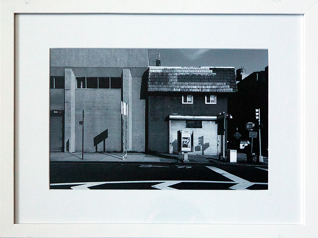
Over four days at the Park Avenue Armory the Association of International Photography Dealers presented photography held by 80-odd galleries. From the dawn of photography to the contemporary scene, there was something for everyone and for almost everyone’s pocket too. Prices ranged from $750 (for press photos- Bob Jackson’s Jack Ruby shooting Lee Harvey Oswald, Eddie Adam’s Vietcong shooting, John Filo’s Kent State student protests etc.) to the most expensive one I noticed, The Black Canyon by Edward Steichen for a mere $850, no wait, add a K to that, $850,000!

Edward Steichen http://www.artnet.com/artists/edward-steichen/the-black-canyon-EJL6cQmXsGHT_AScs65s9A2

It was refreshing to see current photographers talking about their work and also talking (perhaps candidly to me) about the money they might make if they sold their series of prints. This was very encouraging as usually all the money passes between rich collectors and auction houses rather than enabling a living for the photographer- I hate the secondary markets.

I had no agenda as I walked round, just wanted to see what caught my eye and get a feel for what the galleries were promoting.

There were some classics out there, Ansel Adams, Irving Penn, Charles Sheeler, Edward Weston, Henri Cartier Bresson, Eugene Atget and it seemed that Aaron Siskind was featured in just about every other gallery. I noticed a fair amount of abstract work.

I saw a Frederick H Evans in the flesh for the first time and this was joined by the British contingent of Bill Brandt, Tony Ray Jones and Martin Parr at James Hyman Gallery.

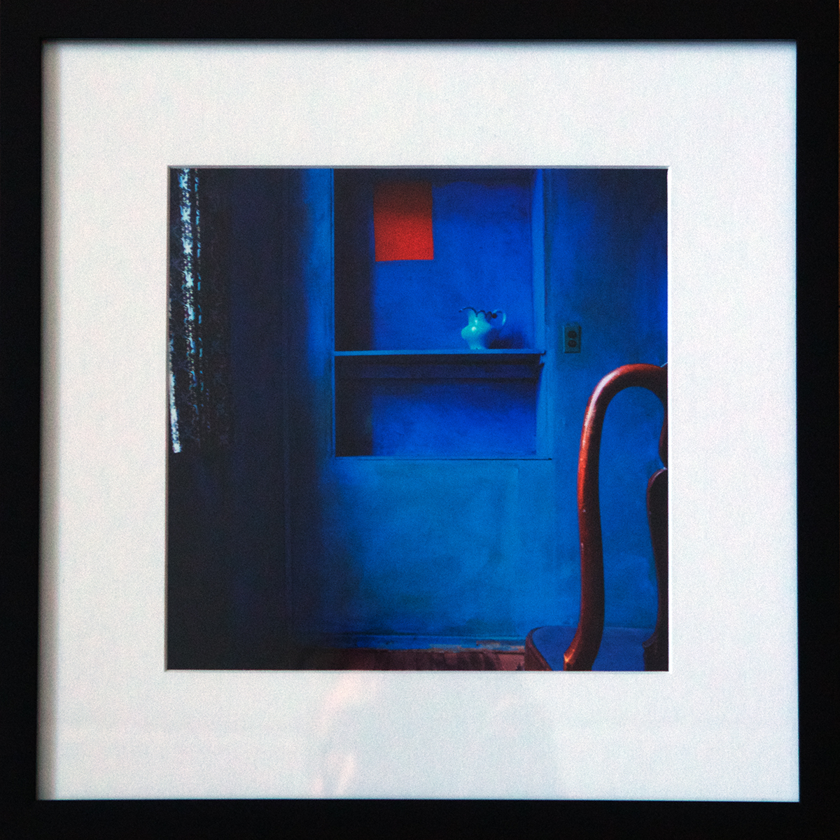
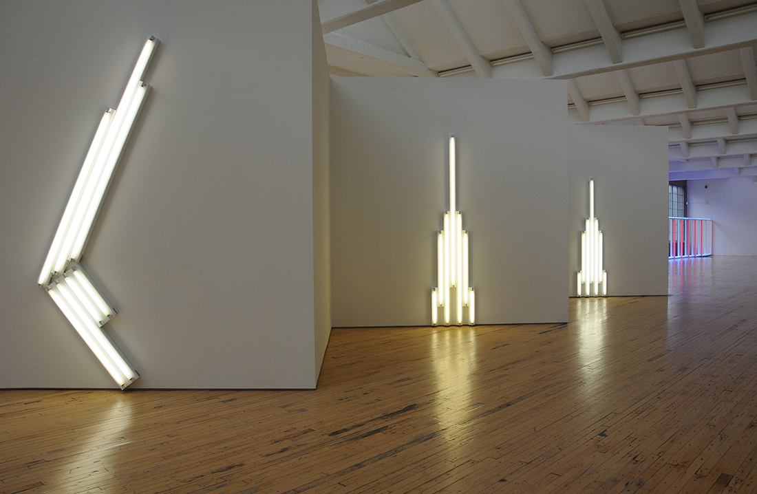
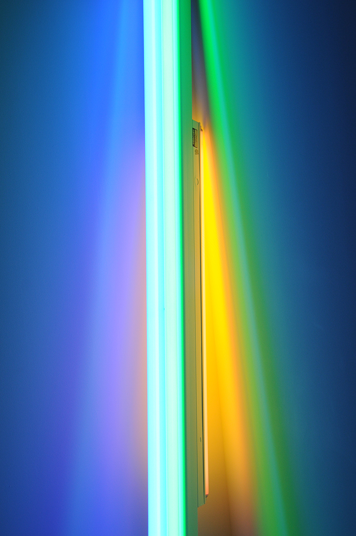
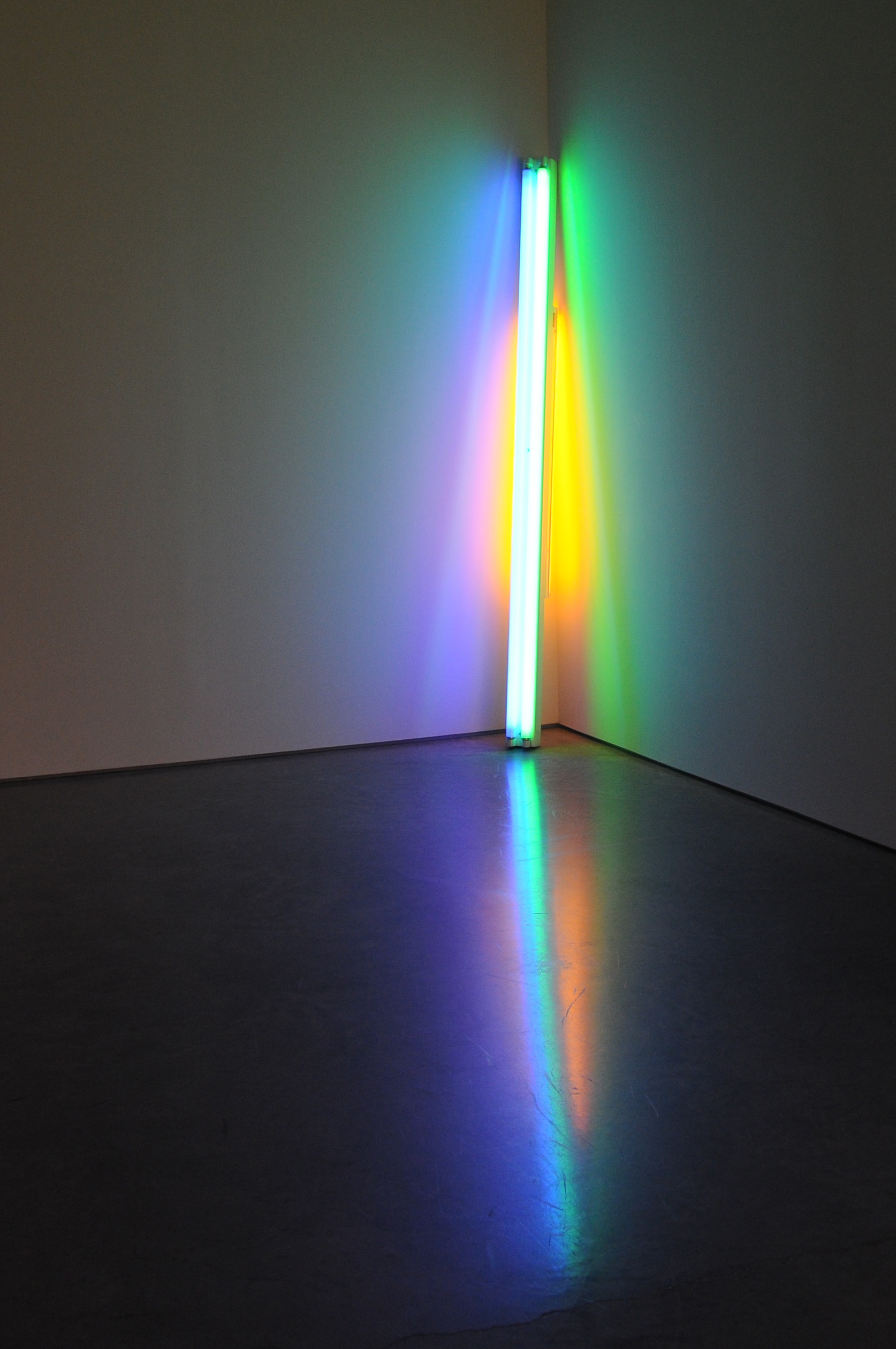
All of these works were like old friends, then I came upon the very abstract, overhead wires of Harry Callahan, framed 5” x 7” for $18K and the rainbow colours of James Welling’s Glass house which are my current favourite images. Something about the study of a single place and those rainbow colours, intense and cheery.

James Welling http://jameswelling.net/projects/14

Whilst it was very enjoyable to see old friends, I wondered if anything more modern would catch my eye and what that would be. So let’s start with Charles Johnstone at Joseph Bellows Gallery and Julie Saul Gallery.

Charles Johnstone http://www.saulgallery.com/artists/charles-johnstone/brooklyn-fences

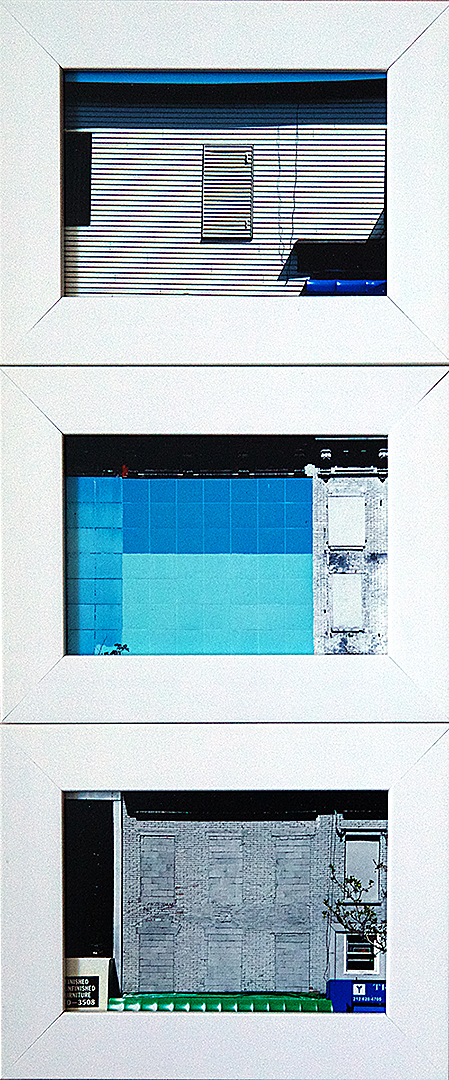
His images of Brooklyn Corrugated Iron Fence appealed to the surface photographer in me. His series are mostly in new York, textural, lush and formal all in one. Iron is a lovely material both new and old to photograph, and I like the fact that each of the singular images fit clearly into the series but at the same time are stunning and fully stand by themselves as individual images. Really rich images.

There was one gallery collection that I didn’t much like. The photographs by themselves weren’t bad, but I felt that the gallery was pushing a particular agenda? Style? The works were clearly picked to relate to other photographers that had a bigger art history following. Jeff Walls, Gregory Crewson and the Bechers come to mind. The photographers were Julie Blackmon and Jeff Brouwa. Both of whom have big bodies of work but only a couple of their works were shown. I’m not sure if it was a reaction by me to the fact that they were so clearly influenced or the fact that the gallery chose pictures that could be recognized as being influenced, as a way to give them more cultural cache. Again, nothing wrong with the images, I just felt  a bit weird seeing them and looking straight through the photographer and seeing someone else. I know that everyone in this postmodern world wants to reference those that came before and I’m down with the idea that everything has already been done, but I think the current photographer/artist gets short changed when they are promoted this way. I took the time to go to their websites and saw full bodies of work which gave me a much better understanding of the photographers and their drive.

Julie Blackmon http://www.julieblackmon.com

Jeff Brouwa http://www.jeffbrouws.com

Next up Lauren Marsolier at Robert Koch which were I think the most intriguing. As cool as can be, all about the lines and fantastic light, but there is something not quite right about the vistas we are seeing. They look real but are not. The beauty is that these images make you think about the probability of reality vs. fictions without being all faked-up looking! What this means, if you see these and think they are real, is a serious discussion on photography and truth that perhaps we can go into that another time!

Lauren Marsolier  http://www.kochgallery.com/artists/contemporary/Marsolier/index.html

Stephen Wilkes, whose images I had seen published, was hanging out at the Peter Fetterman Gallery and was very gracious and chatty and happy to explain his techniques and philosophies. His current work, Day to Night, took him to many cities around the world, including: New York (many times), London, Paris, and Jerusalem. He shot 15 hours of individual images (1200-1500). which he whittled down to about 50 and then layered. What was a surprise to me was that he said that he did not delete people from the scenes, instead as he shot he marked the spots where he captured “suitable’ people and then left those spaces blank in subsequent exposures.

“Ultimate seduko on steroids” he commented. Wilkes’ wife Bette noted that Wilkes was “creating a window on the face of time.” It was awesome too to finally find a photographer who was inspired by Hockney’s joiners. Hockney has given me much to think about over the years with his joiners and I have found them an excellent way of explaining to kids how we “see.” Wilkes was inspired by the joiners showing the progression of time.

Stephen Wilkes http://www.monroegallery.com/photographers/wilkes-dayintonight

David Hockney http://www.hockneypictures.com/photos/photos_collages.php

Finally there were a couple of Gordon Matta Clark photographs at David Zwirmer. I love to see physical pieces of buildings that Matta Clark has cut up but the photographs are great too.

Gordon Matta-Clark http://www.davidzwirner.com/artists/gordon-matta-clark/

The collections on view covered both historical and contemporary work, set up and found, straight and manipulated and the setting was friendly. Perhaps an odd word to use however there was a real buzz about the place. People looking and talking photography who were clearly enamored by photography.

So feeling inspired and content I ended my first circuit of AIPAD.


AIPAD walk through – part two

After a break I met up with some fellow photographers for a tour of AIPAD under the guidance of an art professional. Much more attune to the market and it machinations I thought it would be interesting to view the show through an academic non-photographer’s eyes.

What an experience it turned out to be. Starting from a different concept, that of exploring the ‘theme’ of the show, it was like I had never been in the room before.

Aside from Stephen Wilkes, and a cursory glance at James Welling I can honestly say that there wasn’t one photograph pointed out that I had chosen to look intently at on my first walk through.

In part this was down to my temperament, being drawn to the familiar in both works and genres and in part to fulfill the guide’s needs to tell a certain story, the story of the origins of photography seen through the modern lens.

Through either process or concepts the photographers’ work being pointed out were looking back to the beginnings of photography and with that as inspiration were producing works that gave more than a nod to the past.

At the Glitterman Gallery Pierre Cordier’s ‘Chemigram 29/11/57’ was suggested as referencing William Henry Fox Talbot’ photogram of pine needles.

Pierre Cordier (2nd image in top row) http://www.pierrecordier.com/20.html

William Henry Fox Talbot – Pine needles http://blog.fotomuseum.ch/2012/09/1-dissemination/

Herbert Matter also at Glitterman used a pen light on large format negatives, I think it was Man ray that first started that with his ‘ space writing.’ in the decade before Matters’ works. These works obviously are not contemporary but fulfill the “experimental’ vogue regardless. Photography is of course all about writing with light and sometimes I catch myself photographing the light in a scene rather than the scene itself, so I am quite partial to anything with the tag of ‘light painting’.

Herbert Matter http://www.gittermangallery.com/html/artistresults.asp?testing=true&artist=1908&offset=6

Light painting chronology http://lightpaintingphotography.com/light-painting-history/

We moved onto Lilly McElroy’s image of a woman holding the sun, referencing Magritte and surrealism and then onto Paulette Tavorima whose sumptuous still lives of food, fruit and flowers are reminiscent of 17th century Dutch still lives, where she aims to create ‘old masters’ for the generations to come. I thought it was an interesting fact that she works for Sotherbys as a photographer! Perhaps she actually photographs the original paintings in her day job. It made me wonder if she sources the food and flowers to recreate the scenes to put some 3 dimensionality back into her photography during her own time!

Paulette Tavorima http://www.robertkleingallery.com/gallery/contemporary/tavormina__paulette/

Hannah Whitaker at M&B Gallery. Hmmm. I had some trouble with this work.The images with three rows of bars and the orange toned diamonds were on show at AIPAD.

They were big and the process explained with a whisper of awe as using templates within the film holder, ie not post production but the image made on film in camera. Hannah therefore possessing a technical knowledge and skill, and an authenticity that digital photography and post processing doesn’t warrant.

Hannah Whitaker http://www.artweekendla.com/mb-presents-hannah-whitaker-cold-wave/

But… I’ve read the blurb, I understand the process, and I don’t hate the images, they are just not for me. I can’t get beyond the process. I can’t look at them over and over, nothing new appears to me and I find no way to associate anything personal or experiential with them. Maybe it is because as a photographer I understand the tools and process and so am not as awe struck as others maybe. I think that looking, not just at these but at similar works, has made me realize that I look for the eye and experience of the photographer and in these works ‘a set of limited variables and operations’ is the point. It is I suppose old fashioned to think that photography should portrays elements of ‘life’ to share experience rather than a constant picking apart of the technical instrument and the physical media. Maybe it is the ‘experimentation’ that bothers me, it seems to be so ‘hot’ these days. It is true it is all a throw back to the past but it seems so ‘college’ to me. Which proves I suppose that I learnt my photography at college in the1980s where I played with experimental techniques as a way to learn, but did not make them into a ‘thing’.

Anyway, now I look like a puritan dinosaur, let’s move on.

I am familiar with Matthew Brandt having seen his work at the International Center of Photography’s ‘What is a Photograph?’

Matthew Brandt http://www.icp.org/museum/exhibitions/what-is-a-photograph

In Grays Lake, ID 7, 2013 Brandt soaked the print in the lake water until it affected the image.At AIPAD Brandt again explored process but again brought the image making to the land. He also had building dust in some images. I like the way his experimentation is so related to the land and the physical.

http://www.yossimilo.com/artists/matthew-brandt/?show=0

From there we stay with the land with Dodo Jin Ming’s piece ‘The Sky Inside-II’ a negative print of trees. Her series ‘Free Element’ of ferocious seascapes hark back to the sort of stormy seas you see in old paintings, the ones that usually have a ship with a courageous man fighting the elements and possibly some baddies. Harking back to the older days of photography the sky and the subject were exposed separately and joined together for the print. The sky enlarged to appear even more foreboding than the reality.

It was also great to see a female photographer who gets outside of the studio and who is obviously having an experience we can feel through her work.

Dodo Jin Ming http://www.laurencemillergallery.com/dodojinming.html

Numerically I believe that women are often more tied down by life than their male counterparts and so many women photograph close to home, I certainly fit that stereotype, or in a studio environment. Because of this it was refreshing to see these images.

I have to note that it was pointed out (not by a member of our party of women) that the seascapes were amazing because Dodo was such a tiny, delicate little thing and it was such a tough thing to photograph…  We met her, totally normal size, capable looking woman who was happy to discuss her work with us, (group ignores man…)

Finally we got to Misha Henner whose Dutch landscapes are an intriguing social comment and interesting to look at but which generally annoyed me. I cannot see another collection of curated google images being passed off as a photographic project when really it is a curatorial project. Why would anyone pay to buy these prints, just print them off the internet yourself or better still find another odd ball collection of google images and get your own gallery representation.

http://mishkahenner.com/filter/works/Dutch-Landscapes

Or how about the novel idea of actually picking up some sort of camera/ paper/film, and going out into the world and having an interaction with it? Now that is what a photographer does! Doh! There I go being all old fashioned and having authorship issues again!

There ends my second walk through of AIPAD. Very different from the first. I saw works that hadn’t necessarily drawn my attention the first time round which is always good, but I did feel disappointed in myself that I perceived some artificial ‘trends’ that seem to be pushed by people that are not photographers. Why do I want to see a modern photograph of a piece of lace that looks like the photograph Fox Talbot shot way back when? Why do I have to be impressed when someone uses a view camera, it doesn’t necessarily make their work any more interesting.

Am I just stuck in my ways thinking that I want to see something of the photographer and their experience in the world rather than a look back that doesn’t even seem to connect the two ages with a twist of new experience or even a personal view point?

Take a look at the works I’ve linked to. What appeals to you and can you talk me into a more ‘contemporary’ frame of mind?!


March, Redaction and my Oeuvre

March 08, 2014

I’ve been thinking about Archive lately and how I might explore it further

I’m very much a believer in serendipity and these thoughts coupled with an essay I am currently reading by A.D. Coleman that coincides with the month of March have set me to collating a set of work from my existing files.

The dictionary term archive is defined as a collection of historical documents or records providing information about a place, institution or group of people. Historical, of course, means belonging to the past.

Therefore any photographs I have taken constitute historical, as the time of recording them has passed. But what of the archive? Is it the same as my oeuvre or body of work?

In his essay, On Redaction. Heaps and Wholes, or, Who empties the Circular File, A.D. Coleman quotes the photographer Lonny Shavels who claims that “Photography is about editing. If you don’t edit your work you are not a photographer.” (Coleman, 2000)

Exploring the essay’s title, Coleman states that “The question of redaction of ‘putting in shape for publication’ is a crucial one. Redaction is what transforms a quantity of images from a heap to a whole.’ (Coleman, 2000)

Coleman summarizes that ‘these redacted segments constitute the whole of the photographer’s body of work; the rest – no matter how much it may attract us- is merely part of the heap.’ (Coleman, 2000)

If I am to put Coleman’s words into action I should go through my files and get them ready for (impending or hoped for) publication. Only then will they count as an officially sanctioned body of work.

So, to the heap!

I have previously, partially edited my files. My project Building Character came about from a systematic organization of twenty five years of work relating to my geographical and cultural assimilation of the built environment.

Now entering March, the month has inspired me to think of a new direction. In the USA, UK and Australia March is dedicated as Women’s History Month. March 8th, today, is International Women’s Day. A global day of recognition and celebration and an official holiday in a further 27 countries.

Although my website currently features many images of the physical structures of the built environment I have many unseen photographs of people.

Unfortunately over the years I have not taken photographs of many of the women I have met and spent time with. I am guilty of taking these women for granted. In effect aping what history has done, looking for the exceptional or unique rather than the backbone, the enduring support from where we all spring.

I still have enough though to make a project. But what of the men? Am I to exclude photographs that feature both men and women? That is surely as much discrimination as if I were not to include women. And what of the historical worth of the women I have photographed. None of them were the first to fly solo across the Atlantic, the first to hold elected office or founded modern nursing. I believe that all women touch the lives of hundreds if not thousands of people during their lifetimes and whilst exceptional women are inspiring, all women are exceptional in their own way. Each woman has her place in history and we should celebrate the worth of all of them. After all not one of us would be here without women.

So I have decided to rethink my approach and look to the photography rather than the gender as I sort through my images this is a project that won’t be resolved in March.

I still do want to celebrate women on this day though and remind myself that not all women have equal fortune in life. We should use this day to appreciate the women in our lives and their contribution to their communities before they are no longer with us and fade into history.

I have decided to choose just one photograph to celebrate International Women’s Day. The  two criteria I used  were the woman/women were inspiring and that their environment was also shown. So I chose the photograph below. A simple gathering at the family home with multiple generations present. The missing information that I will supply is that three of these women * touched thousands in their jobs as teachers, at schools and colleges. Passing on their knowledge empowered the children and young adults they met and many owe their success at school and into their work lives to the attention and education these women shared with them.

February 1990, Hutton Road.

TanyaAhmed-WomensHistory

L-R Ted: husband, father, grandfather. (deceased). Teddy*: daughter, sister, mother, aunt, (deceased).  Marlene*: daughter, sister, mother, aunt. (deceased). T: daughter, grand-daughter, cousin, niece. L:  daughter, grand-daughter, cousin, niece. Constance*: wife, mother, grandmother. (deceased).


Reference List

Coleman, A.D., 2000, Depth of Field, Essays on Photography, Mass Media and Lens Culture, University of New Mexico Press, Albuquerque

In the news today

In the news today…

Today I reacted quite strongly to a photograph from AFP on the BBC news website.

The article is about Egypt and if you scroll down to the picture of the children I wonder if you’ll see what I see.

Someone, presumably the parent of the children, has encouraged the children to stand, in support of army rule, by symbolically holding army boots on their heads.

http://www.bbc.co.uk/news/world-middle-east-25924027

It immediately sent a cultural reference through my mind,

Under the jackboot.

Dictionary definitions for jack boot include: (1)  A person who uses bullying tactics, especially to force compliance. (2) The spirit sustaining and motivating a militaristic, highly aggressive, or totalitarian regime or system.

As it turns out several people I asked were not familiar with this phrase. Which led me to wonder about the message this image portrays.

My initial impression from the photograph alone was that these children were expressing their oppression by the army. However, the photograph was accompanied by a caption that said that the children were showing their support for the army.

Hmmm… I still couldn’t see it. How could being stomped on by the army lead to a fulfillment of the rallying cry of the January 25th revolution in 2011- Bread, Freedom and Dignity?

Obviously I was inserting my own cultural reading. I sought out the Egyptian view.

The people I spoke with also found the image very disturbing. There is a division in Egypt at the moment, those for and those against the army. Those against the army have called their opponents, the army supporters ‘slave of the shoes’.

In reaction the supporters of the army, such as the girls pictured, are acting out an Arabic saying  را جزمتك علي راسي  ( transliteration: ghazmitack ala rhasi) that translates to ‘Your shoes on top of my head.’

Basically what this means is that they are showing loyalty to the army, showing gratitude and respect by putting the army (symbolized by the boots) on their head (as opposed to at their feet) and themselves consequently as low as they can go, ie under the boot, level with the ground. Not slaves but willingly level with the actual ground supporting the army.

Still I can’t get how this is a positive statement by putting yourself lower than a boot, literally underfoot, where is the self respect? It gets worse because apparently the idea that you would put a filthy shoe on your head, even an ordinary one, is culturally disrespectful and far from being seen as a way to show appreciation the phrase  جزمتك علي راسي is seen as denigrating to the utterer.

I can’t untangle the psyche of this action but I can think about the photograph and its power. This photograph speaks clearly to me but not in the way it was intended, or does it? Is the photographer for or against the army? Does the photographer know about  جزمتك علي راسي Is the photographer Egyptian or foreign? Posting this image to show support or opposition? Does this image prove how upside down things are in Egypt? Does this image show solid support for the army or a populace ground down with nowhere else to turn? I won’t even venture into talking about the children and their future, just to say what a very sad picture this in on so many levels.

UPDATED: I left this post but feel I have to come back to that photo again. Not being able to see the tops of the boots it could almost be that a soldier is standing on the heads of  these young girls. Demure and innocent, not smiling or shouting, just quietly supporting, wrapped in the flag of Egypt- They are everything pure and submissive that the Field Marshall, the sunglasses hero posed in front of a lion… that natural animal of Egypt, not, needs to gain control. Passivity, and adoration. Not pesky protesting types who want an open democracy or religious types who might object to hero worship. No, adore the Lion of Egypt, cool and manly, c’mon ladies grow up with me as your leader you know that is what counts, that I can succeed on your compliance.

OK that’s it.

Any thoughts on this image?