AIPAD
AIPAD walk through – part one
http://www.aipad.com
Over four days at the Park Avenue Armory the Association of International Photography Dealers presented photography held by 80-odd galleries. From the dawn of photography to the contemporary scene, there was something for everyone and for almost everyone’s pocket too. Prices ranged from $750 (for press photos- Bob Jackson’s Jack Ruby shooting Lee Harvey Oswald, Eddie Adam’s Vietcong shooting, John Filo’s Kent State student protests etc.) to the most expensive one I noticed, The Black Canyon by Edward Steichen for a mere $850, no wait, add a K to that, $850,000!
Edward Steichen http://www.artnet.com/artists/edward-steichen/the-black-canyon-EJL6cQmXsGHT_AScs65s9A2
It was refreshing to see current photographers talking about their work and also talking (perhaps candidly to me) about the money they might make if they sold their series of prints. This was very encouraging as usually all the money passes between rich collectors and auction houses rather than enabling a living for the photographer- I hate the secondary markets.
I had no agenda as I walked round, just wanted to see what caught my eye and get a feel for what the galleries were promoting.
There were some classics out there, Ansel Adams, Irving Penn, Charles Sheeler, Edward Weston, Henri Cartier Bresson, Eugene Atget and it seemed that Aaron Siskind was featured in just about every other gallery. I noticed a fair amount of abstract work.
I saw a Frederick H Evans in the flesh for the first time and this was joined by the British contingent of Bill Brandt, Tony Ray Jones and Martin Parr at James Hyman Gallery.
All of these works were like old friends, then I came upon the very abstract, overhead wires of Harry Callahan, framed 5” x 7” for $18K and the rainbow colours of James Welling’s Glass house which are my current favourite images. Something about the study of a single place and those rainbow colours, intense and cheery.
James Welling http://jameswelling.net/projects/14
Whilst it was very enjoyable to see old friends, I wondered if anything more modern would catch my eye and what that would be. So let’s start with Charles Johnstone at Joseph Bellows Gallery and Julie Saul Gallery.
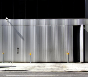
Charles Johnstone http://www.saulgallery.com/artists/charles-johnstone/brooklyn-fences
His images of Brooklyn Corrugated Iron Fence appealed to the surface photographer in me. His series are mostly in new York, textural, lush and formal all in one. Iron is a lovely material both new and old to photograph, and I like the fact that each of the singular images fit clearly into the series but at the same time are stunning and fully stand by themselves as individual images. Really rich images.
There was one gallery collection that I didn’t much like. The photographs by themselves weren’t bad, but I felt that the gallery was pushing a particular agenda? Style? The works were clearly picked to relate to other photographers that had a bigger art history following. Jeff Walls, Gregory Crewson and the Bechers come to mind. The photographers were Julie Blackmon and Jeff Brouwa. Both of whom have big bodies of work but only a couple of their works were shown. I’m not sure if it was a reaction by me to the fact that they were so clearly influenced or the fact that the gallery chose pictures that could be recognized as being influenced, as a way to give them more cultural cache. Again, nothing wrong with the images, I just felt a bit weird seeing them and looking straight through the photographer and seeing someone else. I know that everyone in this postmodern world wants to reference those that came before and I’m down with the idea that everything has already been done, but I think the current photographer/artist gets short changed when they are promoted this way. I took the time to go to their websites and saw full bodies of work which gave me a much better understanding of the photographers and their drive.
Julie Blackmon http://www.julieblackmon.com
Jeff Brouwa http://www.jeffbrouws.com
Next up Lauren Marsolier at Robert Koch which were I think the most intriguing. As cool as can be, all about the lines and fantastic light, but there is something not quite right about the vistas we are seeing. They look real but are not. The beauty is that these images make you think about the probability of reality vs. fictions without being all faked-up looking! What this means, if you see these and think they are real, is a serious discussion on photography and truth that perhaps we can go into that another time!
Lauren Marsolier http://www.kochgallery.com/artists/contemporary/Marsolier/index.html
Stephen Wilkes, whose images I had seen published, was hanging out at the Peter Fetterman Gallery and was very gracious and chatty and happy to explain his techniques and philosophies. His current work, Day to Night, took him to many cities around the world, including: New York (many times), London, Paris, and Jerusalem. He shot 15 hours of individual images (1200-1500). which he whittled down to about 50 and then layered. What was a surprise to me was that he said that he did not delete people from the scenes, instead as he shot he marked the spots where he captured “suitable’ people and then left those spaces blank in subsequent exposures.
“Ultimate seduko on steroids” he commented. Wilkes’ wife Bette noted that Wilkes was “creating a window on the face of time.” It was awesome too to finally find a photographer who was inspired by Hockney’s joiners. Hockney has given me much to think about over the years with his joiners and I have found them an excellent way of explaining to kids how we “see.” Wilkes was inspired by the joiners showing the progression of time.
Stephen Wilkes http://www.monroegallery.com/photographers/wilkes-dayintonight
David Hockney http://www.hockneypictures.com/photos/photos_collages.php
Finally there were a couple of Gordon Matta Clark photographs at David Zwirmer. I love to see physical pieces of buildings that Matta Clark has cut up but the photographs are great too.
Gordon Matta-Clark http://www.davidzwirner.com/artists/gordon-matta-clark/
The collections on view covered both historical and contemporary work, set up and found, straight and manipulated and the setting was friendly. Perhaps an odd word to use however there was a real buzz about the place. People looking and talking photography who were clearly enamored by photography.
So feeling inspired and content I ended my first circuit of AIPAD.
AIPAD walk through – part two
After a break I met up with some fellow photographers for a tour of AIPAD under the guidance of an art professional. Much more attune to the market and it machinations I thought it would be interesting to view the show through an academic non-photographer’s eyes.
What an experience it turned out to be. Starting from a different concept, that of exploring the ‘theme’ of the show, it was like I had never been in the room before.
Aside from Stephen Wilkes, and a cursory glance at James Welling I can honestly say that there wasn’t one photograph pointed out that I had chosen to look intently at on my first walk through.
In part this was down to my temperament, being drawn to the familiar in both works and genres and in part to fulfill the guide’s needs to tell a certain story, the story of the origins of photography seen through the modern lens.
Through either process or concepts the photographers’ work being pointed out were looking back to the beginnings of photography and with that as inspiration were producing works that gave more than a nod to the past.
At the Glitterman Gallery Pierre Cordier’s ‘Chemigram 29/11/57’ was suggested as referencing William Henry Fox Talbot’ photogram of pine needles.
Pierre Cordier (2nd image in top row) http://www.pierrecordier.com/20.html
William Henry Fox Talbot – Pine needles http://blog.fotomuseum.ch/2012/09/1-dissemination/
Herbert Matter also at Glitterman used a pen light on large format negatives, I think it was Man ray that first started that with his ‘ space writing.’ in the decade before Matters’ works. These works obviously are not contemporary but fulfill the “experimental’ vogue regardless. Photography is of course all about writing with light and sometimes I catch myself photographing the light in a scene rather than the scene itself, so I am quite partial to anything with the tag of ‘light painting’.
Herbert Matter http://www.gittermangallery.com/html/artistresults.asp?testing=true&artist=1908&offset=6
Light painting chronology http://lightpaintingphotography.com/light-painting-history/
We moved onto Lilly McElroy’s image of a woman holding the sun, referencing Magritte and surrealism and then onto Paulette Tavorima whose sumptuous still lives of food, fruit and flowers are reminiscent of 17th century Dutch still lives, where she aims to create ‘old masters’ for the generations to come. I thought it was an interesting fact that she works for Sotherbys as a photographer! Perhaps she actually photographs the original paintings in her day job. It made me wonder if she sources the food and flowers to recreate the scenes to put some 3 dimensionality back into her photography during her own time!
Paulette Tavorima http://www.robertkleingallery.com/gallery/contemporary/tavormina__paulette/
Hannah Whitaker at M&B Gallery. Hmmm. I had some trouble with this work.The images with three rows of bars and the orange toned diamonds were on show at AIPAD.
They were big and the process explained with a whisper of awe as using templates within the film holder, ie not post production but the image made on film in camera. Hannah therefore possessing a technical knowledge and skill, and an authenticity that digital photography and post processing doesn’t warrant.
Hannah Whitaker http://www.artweekendla.com/mb-presents-hannah-whitaker-cold-wave/
But… I’ve read the blurb, I understand the process, and I don’t hate the images, they are just not for me. I can’t get beyond the process. I can’t look at them over and over, nothing new appears to me and I find no way to associate anything personal or experiential with them. Maybe it is because as a photographer I understand the tools and process and so am not as awe struck as others maybe. I think that looking, not just at these but at similar works, has made me realize that I look for the eye and experience of the photographer and in these works ‘a set of limited variables and operations’ is the point. It is I suppose old fashioned to think that photography should portrays elements of ‘life’ to share experience rather than a constant picking apart of the technical instrument and the physical media. Maybe it is the ‘experimentation’ that bothers me, it seems to be so ‘hot’ these days. It is true it is all a throw back to the past but it seems so ‘college’ to me. Which proves I suppose that I learnt my photography at college in the1980s where I played with experimental techniques as a way to learn, but did not make them into a ‘thing’.
Anyway, now I look like a puritan dinosaur, let’s move on.
I am familiar with Matthew Brandt having seen his work at the International Center of Photography’s ‘What is a Photograph?’
Matthew Brandt http://www.icp.org/museum/exhibitions/what-is-a-photograph
In Grays Lake, ID 7, 2013 Brandt soaked the print in the lake water until it affected the image.At AIPAD Brandt again explored process but again brought the image making to the land. He also had building dust in some images. I like the way his experimentation is so related to the land and the physical.
http://www.yossimilo.com/artists/matthew-brandt/?show=0
From there we stay with the land with Dodo Jin Ming’s piece ‘The Sky Inside-II’ a negative print of trees. Her series ‘Free Element’ of ferocious seascapes hark back to the sort of stormy seas you see in old paintings, the ones that usually have a ship with a courageous man fighting the elements and possibly some baddies. Harking back to the older days of photography the sky and the subject were exposed separately and joined together for the print. The sky enlarged to appear even more foreboding than the reality.
It was also great to see a female photographer who gets outside of the studio and who is obviously having an experience we can feel through her work.
Dodo Jin Ming http://www.laurencemillergallery.com/dodojinming.html
Numerically I believe that women are often more tied down by life than their male counterparts and so many women photograph close to home, I certainly fit that stereotype, or in a studio environment. Because of this it was refreshing to see these images.
I have to note that it was pointed out (not by a member of our party of women) that the seascapes were amazing because Dodo was such a tiny, delicate little thing and it was such a tough thing to photograph… We met her, totally normal size, capable looking woman who was happy to discuss her work with us, (group ignores man…)
Finally we got to Misha Henner whose Dutch landscapes are an intriguing social comment and interesting to look at but which generally annoyed me. I cannot see another collection of curated google images being passed off as a photographic project when really it is a curatorial project. Why would anyone pay to buy these prints, just print them off the internet yourself or better still find another odd ball collection of google images and get your own gallery representation.
http://mishkahenner.com/filter/works/Dutch-Landscapes
Or how about the novel idea of actually picking up some sort of camera/ paper/film, and going out into the world and having an interaction with it? Now that is what a photographer does! Doh! There I go being all old fashioned and having authorship issues again!
There ends my second walk through of AIPAD. Very different from the first. I saw works that hadn’t necessarily drawn my attention the first time round which is always good, but I did feel disappointed in myself that I perceived some artificial ‘trends’ that seem to be pushed by people that are not photographers. Why do I want to see a modern photograph of a piece of lace that looks like the photograph Fox Talbot shot way back when? Why do I have to be impressed when someone uses a view camera, it doesn’t necessarily make their work any more interesting.
Am I just stuck in my ways thinking that I want to see something of the photographer and their experience in the world rather than a look back that doesn’t even seem to connect the two ages with a twist of new experience or even a personal view point?
Take a look at the works I’ve linked to. What appeals to you and can you talk me into a more ‘contemporary’ frame of mind?!


![[( 6 )]](http://tanyaahmed.com/wp-content/uploads/2014/06/6--212x300.jpg)
