Seen

The Global Pigeon

The Global Pigeon

I love the library! Browsing leads to bizarre finds that often make me think about photography, what I choose to see around me and include, or not, in my photographs.

Not a book I would have directly searched for, I came upon ‘The Global Pigeon’ by Colin Jerolmack, and gave it a go. Set mainly in New York with visits to London, Venice, Berlin and Sun City, South Africa, this book covers birds, social relations, manliness, race relations, tradition, gentrification, and the relationship between nature and humans for starters. Totally absorbing.

The portrait Jerolmack paints of the New Yorkers’ pigeon lofts were particularly vivid exposing a world that before now I’ve only understood as a stereotypical northern English pastime. I did not realize it existed here in New York too. Jerolmack even posted an Andy Capp cartoon, a British character, drawn by Reg Smythe, that I grew up with, famous for being northern and keeping pigeons! Here’s a link to strip different than the one included in the book. http://www.gocomics.com/andycapp/2013/03/17#.UuA1Axb0B0s  (please copy and paste)

Pigeons are plentiful in New York but they are not the only non-human species we live alongside. On any given day New Yorkers also encounter quantities of bugs, rats, mice, seagulls, hawks and raccoons and of course I am not counting all the domesticated creatures we share sidewalks and homes with, dogs and cats, horses, reptiles, guinea pigs, squirrels and even camels on 3 Kings Day.

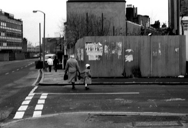
When I am busy photographing the built environment of New York, I sometimes include the people and occasionally even the weather of New York but never the animals. Is it that the animals are not authentic nature, they are too urbanized to be considered wild yet are not considered an urban product, rather interlopers?

Maybe I think that animals do not belong in a representation of cityscape, after all, most of the time I do not represent people in my built environment images so why would I want an animal in there. Animals are there but not always seen, and unless you live with one contact is often a soft step, a wet head, or a shriek as something small dashes over your shoe. Not a relationship, not part of the usual narrative. Something other and apart.

What is funny about the pigeons, and what makes them different though, is that they do get in my photographs. If you look through the projects on this site you’ll notice them creeping into a couple. I knew, of course, that they were there and I haven’t had any problem accepting them. They are as much a part of the experience as the rest of the referent. This is where we acknowledge their special status amongst ‘wild’ animals as almost equals. Not shy, not hidden. The streets heave with people AND pigeons. We walk, they walk, we have lunch, they share it. They cross boundaries that other creatures don’t. We don’t think they are cute, like squirrels. We don’t get freaked out by them as we do with rats. We might not like them but we definitely accept that they share our environment and when their concentration is lower than say Trafalgar Square we don’t even think about trying to get rid of them.

It would be odd to think of chasing pigeons out of my images, in fact it is odd to think about pigeons at all, but after reading this book I think I will thinking about them for a while. When I read in this book about the birds being released I immediately thought back to a photograph I had taken near Marcus Garvey Park, a mass of birds circling overhead. I’d taken the photograph just because it was a sight to see them swooping all together in that clear blue sky. They looked like they were having a good time, really enjoying themselves. Now I am wondering whether they’d been let out from a nearby loft, maybe one in the Bronx that I’ve just read about in this book.

Cambridge, 27-29 East 124th Street opposite the North end of Marcus Garvey Park.

TanyaAhmedCambridge

Have you noticed any of the pigeons in my projects? What do you think – should they be there? Have you got any in your photographs? Why not post one here or on the facebook page?

Staying on the subject of photographs I recently saw the student show at the International Center of Photography and guess what was featured? Yes! Pigeons. The metal cages so perfectly accentuated the iridescent colours of these birds that I became quite enthralled by the images, despite the sorry state of the birds. Maybe some of these birds were ones that had been ‘lost’ during the races I read about in The Global Pigeon.

Mansura Khanam’s photographs:

http://www.mansurakhanam.com/city-pigeon

Jerolmack, Colin, 2013, The Global Pigeon, University of Chicago Press, Chicago.

Talking Photographer

Talking Photographer, or Image maker or Generalist or Artist…

I like Nick Knight’s work, I particularly liked ‘Flora’ and I think his ‘Blooms’ are even better. This guy produces incredible work.

Flora: http://eternal-optimist.com/section/fashion/fashion-news/nick-knights-new-exhibition-entitled-flora

Blooms: http://showstudio.com/project/dynamic_blooms/editorial_gallery

It was interesting to hear Knight speak, (on video, thanks Eric!) and define himself and his work, at the University of the Arts, London. In conversation with Colin McDowell, fashion writer and academic and Frances Corner, head of college at the London College of Fashion.

Knight proposes that photography as we knew it (analog) is dead and so he no longer calls himself a photographer but perhaps a generalist or an image maker. Fair enough.

It was fascinating though to see the academic and the commercial bump up against each other and the stereotypes spill out. It made me think about how photographers are portrayed lately and how it seems to be an insult unless you are of a particular breed.

The commercial photographer embraces new technology and distribution methods whereas the academics think it is important that new photographers get to grips with the technology of the past. I agree with McDowell that a knowledge of what went before probably gave Knight the ability to be what he is today but I also agree with Knight that learning about reciprocity failure might not be crucial to being a good iphone photographer, and that using an iphone doesn’t necessarily make you a bad photographer. (Although personally I hate some of those crummy effects!)

The question of whether photography is an art seems to have died down or maybe it has been circumvented and replaced by questioning who is a real photographer and can a photographer produce art or is the best photography really made by artists using the photographic medium.

Academics seem to be torn between two thoughts. One that a photographer must use arcane technologies, never digital, to prove they are ‘real’ photographers if they are to be accepted into the art world and on the other side artists that use photography including digital are the ones that really should be represented in the ‘photography’ gallery. Work that is not intended for the gallery wall they find hard to place.

This I find borne out by the proliferation of photography classes dealing with the camera obscura, photogram, and of course the ultimate traditional technique, the pin hole camera. Comparing two very different photographers, Nick Knight and Tom Hunter, we can still see that even though they use opposite technologies and subject matter they are still clearly photographers, making images.

I like Tom Hunter’s work and this series, Prayer Places, taken with a pin hole camera, photography at its most basic. Hunter is an image maker/photographer and his nod to the past does not, in my opinion detract or in fact make his images. The images are the thing and the process whilst an integral part of his concept does not become the sole reason for his project.

http://www.tomhunter.org/prayer-places/

In the meantime if you visit MoMA and view their New Acquisitions in Photography you wonder whether the work is by a photographer at all. It feels like an art installation rather than a photography exhibition. It is not the medium or the technique that is the issue, it is the subject matter. Mariah Robertson’s piece ’11’ questions ‘the materiality of photography’. The piece claims to be a photograph but it has nothing much to do with how we see the world, not even tangentially, it exists to explore physical, material, process only.

http://www.moma.org/collection/browse_results.php?criteria=O%3AAD%3AE%3A37833&page_number=2&template_id=1&sort_order=1

Knight talks about the old photography being about silver and the new being phosphorus, glowing from a screen, but his images use process to talk of subject rather than the medium.

Nick Knight might be a generalist, an image maker and an artist but to me he is the epitome of a photographer. It doesn’t matter whether he uses analog, digital, videos or live fashion, when he talks about getting ready to shoot, how for each photograph you start at the beginning again, the intuition, perception, waiting with terror and excitement for that moment, not seeing it, but feeling it and desiring it… well that sounds like a photographer to me!

Watch the whole talk and give a thought also to the tone and discussion of banal and money!

http://showstudio.com/project/in_conversation/nick_knight


http://www.nickknight.com

http://showstudio.com

A Year (and a bit) On

A Year (and a bit) On

The Museum of the City of New York does a great job with educating through its exhibitions. Rather than just displaying artifacts, the exhibitions are often themed and have panels of information rather than itty bitty labels.

Still, though, when I heard about a photography exhibit I got it into my head that it would be different. Something pretentious in me assumes I have no need for words as I understand photography in a way that I don’t with other subjects. Of course though the exhibition wasn’t really about photography at all, it was about an event that we got to share physically as New York residents and then re-share with others through the medium of photography. The panels provided sobering figures and information that amplified the effect of the photographs.

The Museum put out an open call to professionals and amateur photographers and got a response from 900 photographers who submitted around 10,000 images. I was one of them but sadly not chosen. In fact there were such a small amount chosen that a second selection was culled and put outside the main gallery on a video loop so that another 400 images could be viewed.

So, what was it all about? Hurricane Sandy. The exhibition was opened at the one year anniversary and detailed the event through six sections Storm, Destruction, Coping, Home, Relief and Not Over.

Opening just days before Hurricane Yolanda/ Haiyan, which was a stark lesson in the difference between first world and third world infrastructure and response, the exhibition none the less covered many of the same shared experiences.

With areas of New York burnt, flooded and blacked out there were many photographs taken by residents who used photography as a way to process, prove, preserve and share the unbelievable events happening around them.

Of course there were many stunning images of waves, cascading waters, floating cars and destroyed houses but what struck me were some of the images of after the storm had passed through. The photograph outside of Fairway supermarket with shopping carts tightly packed together, full of useless food and the inside of another store where the dairy shelves were bare because there was no electricity and therefore no way to keep fresh food. The No Gas signs, cutting people off from travel or escape and the iconic views of Manhattan, half erased in the blackout gave a deeper look into the far reaching consequences of the storm. Many of the images were of people planning, organizing and helping each other, engaging in recovery and these brought the attention from images of nature’s power back to the sympathetic human level.

Frightening really to think that a bit of weather blows through and modern New Yorkers are left without shelter, food, power or gasoline.

The exhibition was less a show about photographic skill, although there was much evident, and more a tale of a city’s ongoing response to adversity. There was a small section on the use of cell phone photography, the everyman photojournalist dispersing images. I remember watching a steady stream of cell phone images on the local new station NY1 as New Yorkers tracked and shared the storm’s path in real time. The way people used photography was interesting too, a large scrapbook by a Rockaway’s resident, professionals made series, residents shot out of their windows, some photographs were official documents, some photographs were sad but others captured fun, I am thinking of one image, taken I assume as the storm approached, of a small group of people feeling the wind blow on them, their bodies pushed backwards, their arms and hair up in the air, enjoying the awesome power of nature and demonstrating the folly of the young in thinking that they are invincible.

I took a few photographs too as the storm passed over. In my neighborhood the East River spilled over, drowned the FDR highway and turned First Avenue into a raging river. We watched as the surge came up the Avenue, drowning cars in its path and entering buildings. Our building was lucky, thanks to some quick moving by residents to barricade the entrance. The water got into the building but didn’t get into the elevators or electrics, unlike some less fortunate buildings who lost power after they got waterlogged. The FDNY stayed ahead of the flooding on scene to assist motorists who couldn’t  get away fast enough.

I had a few previously booked days off so had the time and could have gone on to take further images but I wrestled with the idea of it. Spared from ongoing damage by living uptown I struggled with the idea of going downtown or to the other boroughs to take photographs of the misery of others. Especially when  the images I took would not be used in any informative capacity, ie by the press or other official capacity but would merely be portfolio pieces. In effect I’d be a disaster tourist. I decided not to do it and in fact one of the great things about this exhibition was that many of the photographs were clearly taken by people, amateur and professional, acutely affected and resident in the communities they were documenting. Taking it like it was.

Museum of the City of New York  http://www.mcny.org/exhibition/rising-waters

Twitter #risingwaters   https://twitter.com/search?q=%23risingwaters&src=hash


DPRK; Delete!

DPRK; don’t mess with us or we’ll delete your photo.

Earlier this year the Metropolitan Museum of Art hosted two exhibitions.                    One was ‘ Faking it. Manipulated Photography Before Photoshop and the other was ‘After Photoshop. Manipulated Photography in the Digital Age’.

Large, informative and very interesting shows and of great relevance today as the establishment tries to define what is acceptably manipulated in a photograph that tries to offer a truth of what it represents.

Of course photographs generally do not come out of the camera ready. As the photographer Edward Steichen said in 1903 “Every photograph is a fake from start to finish, a purely impersonal, un-manipulated photograph being practically impossible.”

Negatives would be printed, sandwiched, manipulated, and prints collaged, and digital raw files get a handful of ‘tweaks’ and are saved as a different file altogether. Sometimes the treatment is obvious, sometimes not. Let’s not forget that the photographer in composing the image chooses just a minute portion of a much greater scene thereby determining a highly selective point of view.

Generally I am a tweaking, but keeping it real, type of photographer, but also believe that if you want to be ‘arty’ within or even on a photograph, then why not? When I approached some of the photographs in the exhibition though it became a question not of what and how but of why. It was with some questioning that I came upon the images of Stalin where people who had been in a photograph with him, after falling out of favor, were removed from the image.

[Kliment Voroshilov, Vyacheslav Molotov, Joseph Stalin, and Nikolay Yezhov on Moscow-Volga Canal, Moscow]

http://www.metmuseum.org/exhibitions/view?exhibitionId=%7b36D81705-241D-4934-AB02-FD7C8DBBB3E5%7d&oid=294848&pg=3&rpp=60&pos=158&ft=*

[Kliment Voroshilov, Vyacheslav Molotov, and Joseph Stalin on the Moscow-Volga Canal, Moscow]

http://www.metmuseum.org/exhibitions/view?exhibitionId=%7b36D81705-241D-4934-AB02-FD7C8DBBB3E5%7d&oid=294849&pg=3&rpp=60&pos=157&ft=*

Being a fan of the author George Orwell and his book 1984 I recalled his words as I viewed history photographically rewritten by the Soviets. But hey this was a long time ago. Photography was fairly new and maybe they hadn’t thought through the fact that photographs are eminently reproducible and distributable and therefore an old and a new copy might surface together in the future, as they have done here in the Met. Maybe it only mattered in their present and they thought the archives would reflect what they kept. Perhaps also they thought they would remain in charge of the archives.

It seems odd to think that they thought they could get away with this alteration of already dispersed photographs. When I saw the photographs at the Met they were from such a long time ago, and a now defunct system, that they seemed really to be irrelevant to the issues we face today with alterations happening before we see images, rather than after they have entered the public space.

You can imagine my surprise then when I was confronted with the same issue in recent news reports. With the sudden execution of North Korean Chang Song-thaek, the Uncle of the country’s leader Kim Jong-un, the regime has begun to rewrite history just like the Soviets did by erasing the image of the executed uncle from photographs.

Today is 2013 though, now we have the internet and all the world can see that the original images have been tampered with and the narrative adjusted. We are visually familiar with the Uncle from his years accompanying Kim Jong-il so we can’t be persuaded that he was not a part of the North Korean leadership. I don’t understand why these images have been doctored, they do not erase the fact of the man.

We can of course not be quite sure that it isn’t some sort of conspiracy – by the West or North Korea or even just an individual because everything we hear reported from North Korea just sounds so odd that it can be hard to understand whether what we hear is truth or propaganda.

But if it is true that the regime is having people removed from images do we think that the North Korean people don’t know this? Does the North Korean leadership think that we do not recognize this? If people are aware that these images are being tampered with doesn’t this make the regime look a bit ridiculous?

There are many ways of removing people from photographs and the images we are shown in the Guardian newspaper show us a few of these. The easiest way is to crop the image and I think this is a perfectly valid way of getting rid of someone without lying!

Have you fell out with someone and torn a photo of you and them in half. You tossed the half with the other person and kept the image of yourself. All you have done is re-crop the image. You still inhabit the space you did however, through losing the material, you make the visible space smaller and therefore have a smaller angle of view. In fact there is even a frame for a newly torn image available by mail order…

droppedImage

This close cropping has been done with some of the North Korean photographs. Others have been replaced with images from the same event where the photographer has chosen a different angle so the offending Uncle is not in the image anymore. Some of the drama the Guardian newspaper is trying to create is really quashed as I find these valid ways of showing the truth, all be it in a more narrow way. Just moving your camera one way or another doesn’t alter the truth it just pertains to a different portion of it.

What I don’t understand, and what gives the article its credibility in reporting that something strange is happening, is in the photographs where it is obvious that the image has not been cropped at the edges, nor the scene taken from a different viewpoint, but where the uncle has been erased from the middle of the image.

http://www.theguardian.com/global/gallery/2013/dec/09/kim-jong-uns-uncle-vanishes-from-documentary-footage-in-pictures?search=Kim+Jong-un%27s+uncle+vanishes+from+documentary+footage+-+in+pictures

As I am writing this, I check the Guardian I have found a further article on the archives being deleted.

http://www.theguardian.com/world/2013/dec/16/north-korea-erases-kim-jongun-uncle-archives

Going to the BBC site, you can see, shown in the photograph they present, a centrally posted newspaper, ostensibly in North Korea. Maybe it is still possible to control what people see. If this is how the state run newspapers are read by the people, the information accessible to the people is obviously very tightly controlled. http://www.bbc.co.uk/news/world-asia-25399143

But still, of course, the people know the Uncle has been executed. They can’t be told that the Uncle didn’t exist so the purging of the images in what looks like a fit of pique is something much more sinister, it’s a warning to the people about the total control the state has over its individual members even close knit, high ranking relatives. In life, death and even in the archives. That is scary stuff.

The Metropolitan Museum of Art – Faking it

http://www.metmuseum.org/exhibitions/listings/2012/faking-it

The Metropolitan Museum of Art – After Phtooshop

http://www.metmuseum.org/exhibitions/listings/2012/after-photoshop


Art as Therapy

Art as Therapy – Book

I thoroughly enjoyed the book ‘The Architecture of Happiness’ by Alain de Botton and when I saw his newest title, ‘Art as Therapy’ in my local bookstore I knew I had to read it. The book questions the way art is presented, amongst other issues. One concern is how we might understand and enjoy more of art if it wasn’t labelled by the artistic period, historical journey or style, and other information that assumes we have a prior knowledge or interest in art history. De Botton speculates as to whether we could connect with art more if its positioning took advantage of our everyday understanding and feelings. De Botton is going so far as to actually engage several museums and he will reorient, reclassify and relabel works of art. Unfortunately this will not be local to me, so I will have to hope for a web or print presence later.

There are of course several examples in the book but one really struck me. I am not much of a fan of paintings of the ‘Madonna and child.’ The plethora of such images and the religious tone, has always prevented me from even bothering to look at these works. The painting discussed is called ‘Christ appearing to his mother, 1496’ by Juan de Flandes, you can see it and read the label that accompanies it here… http://www.metmuseum.org/collections/search-the-collections/437489  Not exactly scintillating prose it is?

De Botton’s suggested label talks of the history of the relationship of the subject with the world and this shocking encounter with his mother. It runs to four paragraphs the last of which says… ‘The picture makes the claim that such moments of return (and survival), though fleeting and rare, are crucially important in life. It wants men to understand- and call- their mothers.’(de Botton, 2013) It’s on page 91 of the book if you want to check it out in its entirety.

After I read this I looked at the painting once more and because I had emotional information to go on I found it easier to find a connection. It tapped into my role as a mother. Could I see the things suggested in the image? Could I feel the emotions now I understood the history of the relationship pictured, rather than the location of the painting? Could I now connect with the art? One half of me feels that perhaps if I wasn’t such a simpleton when it comes to traditional art I wouldn’t need to be so forcefully led to even think of really looking at this image. Everyone knows that if you have to read the label you are not looking at the work carefully enough. The other half of me acknowledges though that art is for all and what is  the point of people going to the museum and not being able to really interact mentally with what they see or even worse not going because they lack a scholarly intellect.

De Botton explores seven functions that he assigns to art. These are the things that art can help us with. In other words art’s function is to help us explore and deal with these issues:

Remembering, Hope, Sorrow, Rebalancing, Self Understanding, Growth and Appreciation.

Whilst I generally agree that art can do this and in fact does this for me through my own photography I am perhaps leery of the idea that art can be clearly categorized under these labels. Which is what de Botton intends to do in the upcoming museum curations he will do. Who is to choose what quality each artwork carries? I may look at an image and be filled with sorrow whereas you may look at the same image and be full of hope. Does this mean that the artist’s work is not good, if it is not clear enough to be read by the viewer? Maybe. It could be though that we bring such cultural baggage with us that we may not recognize work from different cultures or times or in fact our own life experiences and concerns may just be pull us in a different direction from other viewers looking at the same work.

I recently asked for comments on several photographs of mine hoping to validate my experience and reason for making the image. Looking at them without any outside information I found that observers are just too individualized to all have the same reaction and in fact the participants had very different thought processes, life experiences and therefore reactions to each image. I also found that specific colors and lack of a human presence triggered specific cultural responses. Simplistically put for this image as blue equals sad and empty means lonely.

The image below carried negative connotations for some , one made a witty comment and a couple understood the meditative aspects of the spaces pictured as being positive. As de Botton noted in ‘The Architecture of Happiness’ ‘We seem incapable of looking at buildings or pieces of furniture without tying them to the historical and personal circumstances of our viewing; as a result architectural and decorative styles become, for us, emotional souvenirs of the moments and settings in which we come across them.’ (de Botton 2006). Applying our own set of experiences can from one person to another twist the emotional response.

Here is my photograph and below a few of the comments it inspired. How do you feel about this image?

TanyaAhmedBlue


Abandoned emptiness, I leave
in a hurry, to escape
the blueness, the anger, the hopelessness of my soul.
I sit alone
staring out of the window
hoping for a freer life.
I’m gone, no longer stuck
in the blue room of my mind.
I’ve left behind what isn’t mine. (Alison)

When I returned, he’d stripped my yellow room and daubed it a vicious blue. He’d gone, but he’d walked his paint all over the house. Even now, months later, I find his blue fingers stuck to a shelf, flicking through a book, crawling under my bed.  (Brenda)

I’ve gone to get a life now.  Goodbye loneliness, goodbye emptiness, goodbye monotony.  Hello world — here I come!  (Evangeline)

To me it recalls Van Goch’s painting of his bedroom in Arles: the intense colours, the floorboards, the chair. The walls may not be yellow, the shelves are empty and the jug has no flowers. There is no inhabitant here now but maybe his inspiration remains.  (Nicholas)

Why oh why
did I not buy
that second tin of paint ? (Dick)

Grandma’s Jug

Her brushes have gone

and her empty jug awaits its fate.

The paint encrusted carpet has been taken

like her.

Away.

The tell-tale smell of turps still lingers in this blue,

blue room,

singing silently of hours at the easel.

She will wither away

in the pastels

of that place. (Denise)

When I look at this picture I see red. A study in scarlet, a drop in a turquoise ocean. (‘Will all great Neptune’s ocean wash this blood clean from my hands? No, this my hand will rather the multitudinous seas incarnadine, making the green one red.’)

The surrounding blue is an extraordinarily intense combination of azure and turquoise – an essence of the Mediterranean and North Africa. I think sitting in the room would be a form of colour therapy – I imagine being bathed in the intensity of colour, with the life force seeping down to my bones and warming my blood.

I wonder who painted it those colours. Was it their escape from a grey outside world – a rich, jewel-coloured cocoon, a place of respite and recovery?  (Eileen)

This photograph is currently featured in the exhibition;

Memory: International Mail Art Exhibition and Swap
Coordinated by Kathy Tycholis at the Richmond Art Gallery, British Columbia in Canada. An online gallery of all the works will be up in January.

http://www.richmondartgallery.org/mail-art-2013.php

Armstrong, John and De Botton, Alain, 2013, Art as Therapy, Phaidon Press, New York


Australian Boys

Australian Boys.

I was looking at The Contemporary Australian Family Photographic Project presented by the Fier Institute (on Vimeo) when I was struck by an image of an Australian family with brothers. In fact I had  a twinge that told me I knew these boys and that in fact I had photographed them before.

The black and white photograph was by Kevin Cooper  and had brothers just a little older than brothers I had photographed. The boys in my photo would be men now and Cooper’s still boys, as he took his photograph within the last two years. I could see they weren’t the same boys…

But those T-shirts.

Yes, t-shirts. The sleeveless stripy t-shirt made me think of those boys and imagine for a second that another photographer had photographed them too. I had to dig out the photograph, I wanted them to be the same boys, I wanted some one to tell me how they are doing. I wanted someone else to know them too. Of course I knew they weren’t the same boys, they didn’t look the same, the family make up was different and of course Cooper had only recently photographed this family.

I don’t believe that photography steals your soul but I do believe photographs have power. I remember when I met the two boys and spent the day with the family. I remember what we did, what I felt, where we were. I would never in a million years have remembered what they wore. I don’t remember what I wore. And yet a photograph with a stripy sleeveless shirt instantly, takes me to these children as if I had taken the photograph yesterday. My memory of the photograph is strong and I am glad that I have photography to remind me of the details I have forgotten. This shirt triggered the memories that I have. Remembering the photograph didn’t delete or override the memories I made on that day it just became a convenient switch to bring them to the fore.  I love that about photography. I wonder where these boys are today. I hope they are strong men, healthy and happy in their lives.

Note before viewing the images.

I photographed the boys with permission and even though the boys would still be young men I am including the following statement, out of an abundance of caution as I do not know their current whereabouts, to respect the customs of the boys and their family, should the worst have happened.

The following photographs may contain the names or images of people who are now deceased. (Some Aboriginal and Torres Strait Islander communities may be distressed by seeing the name, or image of a community member who has passed away.)

Photograph by Kevin Cooper  https://vimeo.com/38479744 the photograph I am discussing is at the 5.00 mark

PhotobyKevinCooper


Photograph by Tanya Ahmed of Chungari aged 5 and Jabarula aged 9

Chungari_Jabarula_TanyaAhmed


London From Punk to Blair

London From Punk to Blair.

In this book London is black and white. My London is black and white, a bit chilly and a bit rough. But then my London isn’t now, it’s back in the 1980s. Sure, I’ve visited London recently but I don’t remember when any of those new buildings went up.

Reading this book coincided with a trip to the brutalist South Bank. I’ve had many adventures there including an exhibition and appendicitis. They’ve splashed a bit of colour on parts of it but it is still a great blank, concrete platform to launch from. It needs people to add their activity to make the place come alive and there was plenty of activity when I was there recently.

The Long Live South Bank campaign was in full swing. The aim, to keep the underbelly filled with skateboarders rather than yet another shop/restaurant catering to the pursuit of capitalism. I’m not sinking into nostalgia here. I’ve never been a skateboarder, in fact the much vaunted graffiti wasn’t always there, but who is the South Bank for? Just adults shopping or kids too? Sitting with small children in the Sandy Village, we watched the skateboarders, participated in the performance art, hit the book stand, strolled on the beach, went to two exhibitions, had lunch (from 4 different countries) from the market stalls. We interacted and spectated. There were all manner of people. Young, old, local, tourist, rich, poor. All doing.

I come back to London and see the Palace. Who cares? My companions, visiting as first time tourists, seeing the ‘sights’. I get to the bookshops I haunted on Charing Cross Road. Foyles boring now, just like -insert name of chain here- it used to be fun rummaging in the old fashioned shop. Al- Hoda gone, I can’t complain, I left, London moved on.

But reading this book, brought my London back to me, talking about Hackney and Camden, the South Bank, Brixton. I dipped in and out of these neighbourhoods, working part time, full time, studying, staying with friends, going up at the weekend, getting a flat.

I knew about street photography and studio photography back then. I went on political marches. We tried to free Nelson Mandela from Hyde Park. It seemed like a serious place.

Maybe it is all about the weather though. Not nostalgia or gentrification. I see London with typically English weather and old brick. I live in sunshine surrounded by gleaming skyscrapers.

I cannot see London in shiny and colour even though I have seen the Shard, the gherkin, the new bridges, the London Eye. Is it because the sky is so often full of heavy clouds, that greyness suits the place? Is it in my mind, am I just sunk in nostalgia or does the new London popping up feel a bit odd? Like an add-on, not an update or an expansion, like a transplant from somewhere else?

I went through Docklands, it was sunny, it was like a little New York, without the rough edges, I liked the view, but it didn’t feel like the real London to me. I’ve started to realize that the 70s and 80s weren’t just a few years ago, they were decades ago and yet, London, away from the new bits, looks the same to me.

I have forgotten to talk about the book. Best to read it yourself. It talks about the culture, the architecture, the weather, the people. If you’ve lived in London during that time most of it will resonate with you. If you didn’t you’ll get a real feeling for the time and place, it’s a book of sensibilities rather than a history text book,it’ll make you think about how you think about London. This book scared me a little. It’s a good read, good food for thought.

Even though it’s not a photo book it is heavy with excellent photographs. The book made me think back to some street photography I did in Brixton. I don’t do street like this anymore and I thought how it would be interesting to look back at both my photography and the people and place of Brixton.

I know that some of you reading this blog also have Brixton (or London in the 80s) in your photo files, why not dig some out and post them here. Back then we couldn’t post them, we didn’t have internet and blogs, our images sat in boxes. Let your images see the light.

London From Punk to Blair                                                                                                          Edited by Joe Kerr and Andrew Gibson                                                                              Photographic consultant Mike Seaborne                                                                                        Reaktion Books, London, 2003

BrixtonTanyaAhmed1

BrixtonTanyaAhmed3

BrixtonTanyaAhmed2

BrixtontanyaAhmed5

BrixtonTanyaAhmed14

BrixtonTanyaAhmed7

BrixtonTanyaAhmed6

BrixtonTanyaAhmed8

BrixtonTanyaAhmed4

BrixtonTanyaAhmed11

BrixtonTanyaAhmed9

BrixtontanyaAhmed19

BrixtonTanyaAhmed18

BrixtonTanyaAhmed12

BrixtonTanyaAhmed13

BrixtonTanyaAhmed10

BrixtonTanyaAhmed17

BrixtonTanyaAhmed16

BrixtonTanyaAhmed15

BrixtontanyaAhmed20


Click on images to see them larger.

James Morris

October 13, 2013

James Morris, Time and Remains- Reflections on the Palestinian Landscape.                 Aberystwyth Arts Centre until November 2nd 2013

I’m not sure how I stumbled across this photographer’s work but I am glad I did. His website is a feast for the eyes, with a penchant for architecture and landscape that really exposes culture.

I will not be able to see the exhibition because it is in Wales, but I’ll bet that it looks much more magnificent on the wall than on the computer screen. But here I want to talk about how good it does look on the screen. I have noticed that most photographers and artists do not display whole collections on their websites and I understand why. After all, if everything is available at the click of a button who would trek out to the gallery, or spend money on a book or a print.

I used to think like that too, but then I realized that it was akin to hiding the work and that is not why I made it. I make my images it to share. When we consider this body of work presented by Morris it is available on his website with detailed captions for that very reason. It is a work that needs to be shared. Has to be shared. The detailed writings about the images are concise and unemotional but hugely impactful. I can only imagine what it must be like for someone unfamiliar with the history to encounter these images and words, the two must go together here for maximum effect.

So what is the work all about? There are two sections, That Still Remains and When This Time Comes. The former looks at remnants of the past, the other the contemporary situation. I don’t need to say more as the website has a great written introduction.

I implore you to take the time to wade through the words so that when you look at the photographs the  history will manifest itself within the visual experience. Stick with it to the end. I found it a very rewarding if somewhat upsetting experience. It was interesting because having the words changed some of the desolate images from a feeling of sadness and emptiness to rage, and that is a first for me with landscapes!

The link to the work in the exhibition is all on one page, just start at the top and scroll down. When you are finished take a look at the rest of the work on Morris’ website. Let me know what you think.

http://jamesmorris.info/portfolio/time-remains-reflections-palestinian-landscape/


Photoville

Photoville

I popped into the 2nd annual Photoville on opening night, September 19th, what a great experience.

If you don’t know what it is – basically, it is a collection of shipping containers that serve as exhibition spaces for photographers or photographic organizations. These exhibitions are then rounded out with talks and classes. The site is on the edge of the waterfront in Brooklyn Bridge Park with a divine view of lower Manhattan and features a 1000 foot ‘photo fence’ displaying several photographers’ series of work. The event is free and inclusive to both the passerby and the serious photographer. Arriving before the sun set and subsequently watching the lights rise over Manhattan I experienced the site in both day and night. There were works best appreciated in one or the other, the images on the outside walls of the containers better appreciated in daylight, the digital projection and TIME LightBox images obviously better in the dark.

And what a projection. Apparently different on different nights, the projection I saw was the ‘Fence’ photos and several series that were almost accepted, honorable mentions. They were all fascinating for both photographic skill and subject matter. The series that really grabbed me though was one from a different genre than usually interests me, that of surfing photography. I haven’t found them online to share a link with you which is a shame because they were underwater and really amazing. Another one was a diptych where a man and a woman were photographed and then in the second picture they had stayed in the same place but had switched their clothes- funny and interesting thinking about the cultural baggage we attach to how we drape pieces of cloth around us.

Of the many amazing collections exhibited in the containers, far too many to discuss in detail, I was particularly drawn to these four.

My favourite, Ocean Beach by Douglas Ljungkvist. Living in Brooklyn and vacationing in Ocean Beach Ljungkvist set out to capture the utilitarian yet beautiful seaside cottages, built in the 1940s, with their traditional and simple decor, before they were all revamped with modern ‘styling’. Serene, calm and with a gorgeous colour palette and definitely evidencing a look of the past, these images suddenly take a turn when the destruction wreaked by Hurricane Sandy destroyed the neighborhood. Ljungkvist carried on photographing with the same delicacy and form but what was left of the cottages changed the images from an almost surreal fashion and time-gone-by portrait to a record of savage destruction and a realization of a time and tradition lost forever.

Without showing broken people or poignant knick knacks Ljungkvist manages to create horror not only in spite of but perhaps because of his gentle tones and formal compositions. To see the jagged, broken houses breaking out of the sand belies the ‘perfectness’ of his style of photography and unsettles the viewer almost unconsciously, not with shock but with a creeping and accumulative melancholy as realization of what happened dawns upon the viewer. Destruction of a way of life and a community.

www.douglasljungkvist.com/projects/Ocean-Beach

My next pick, Tyler Hicks: One Year. Hicks trades in shock of the traditional photojournalist style. A staff photographer for the New York Times, Hicks has worked in Iraq, Afghanistan, Somalia, Libya, Syria, Africa and covering the Arab Spring. His images, technically perfect and beautifully composed, hold you in spite of their terrible subject matter. The question that faced me as I looked from images of one desperate child to another is which affects us most. Has the starving child in Africa with his forlorn yet still handsome face lost his pull when we see the dead child carried aloft the crowd in a bombed city and the wretched sadness of the adults carrying him. Have we gone beyond the shock of starving and now respond to blood and anger, or are we still not being moved? Not all of his images are in your face, some are less violent but even those that you have to ‘read’ a little more still force your brain to uncomfortable places. We need these images to bear witness but will man’s stupidity, greed and ignorance ever end? When I compare the images of Ocean Beach destroyed by nature and Hick’s images where lives are destroyed by other men’s actions Hick’s images make me feel angry and impotent. Will his images change the world? Unlikely because man seems to have an infinite tolerance to destroying or taking advantage of the other for the benefit of self. AGGGHHHHHH.

http://lens.blogs.nytimes.com/2013/09/18/at-photoville-hickss-photographic-year/

PS Whilst we are in comfortable NYC pondering the art and meaning of his images Tyler Hicks was in the Westgate Mall in Nairobi, Kenya, (where he lives) photographing the results of more pointless violence.

http://lens.blogs.nytimes.com/2013/09/21/witness-to-a-massacre-in-a-nairobi-mall/?_r=0

Many of the images on show at Photoville were dealing with difficult or thought provoking subjects. My third pick is ‘Photo Requests from Solitary’. A coalition of organizations worked with Tamms Supermax Prison in Illinois asking the inmates in solitary confinement to request a photo of anything and the group would find a photographer to take it. Not getting into the debate about what these inmates did and whether solitary is deserved or not, just to put yourself mentally in a position where you are so cut off from people for a decade, what would you visualize? As I walked into the container and had a look around two of the images struck me, one an inmate’s picture superimposed on a big blue, sky with fluffy white clouds and another of a crowd of people. Both fairly obvious requests I would have thought but imagine not being able to encounter either that freedom or the ability to be with so many people. The clown and the horse were less obvious choices and perhaps speak to another way of thinking that separation forces on people. The exhibition was staffed by people who had been in solitary, had family in solitary or advocates against isolated confinement so the photographic project was impetus for a larger discussion on human rights. An interesting use of photography to enable a way of trying to understand a life style so different from most of our experiences.

http://www.yearten.org/category/cultural-projects/photo-requests-from-solitary/

Finally what photographer doesn’t love a photo book. The Indie Photobook Library had a container too with a selection of its collection on show, 70 books and some prints, a ‘A Survey of Documentary Styles in the Early 21st Century’. If I had had more time I would have read each one there, as it was I handled a few and was attracted by a small book full of greenery with extra thick pages, it felt really good to hold, like one of those kids books that can handle a bit of chewing at the corner, of course I immediately forgot the photographer’s name, so if you get down there and see it let me know!

http://www.indiephotobooklibrary.org/

Did you go to Photoville? What peaked your interest? If you didn’t go what do you think of the work I shared here?