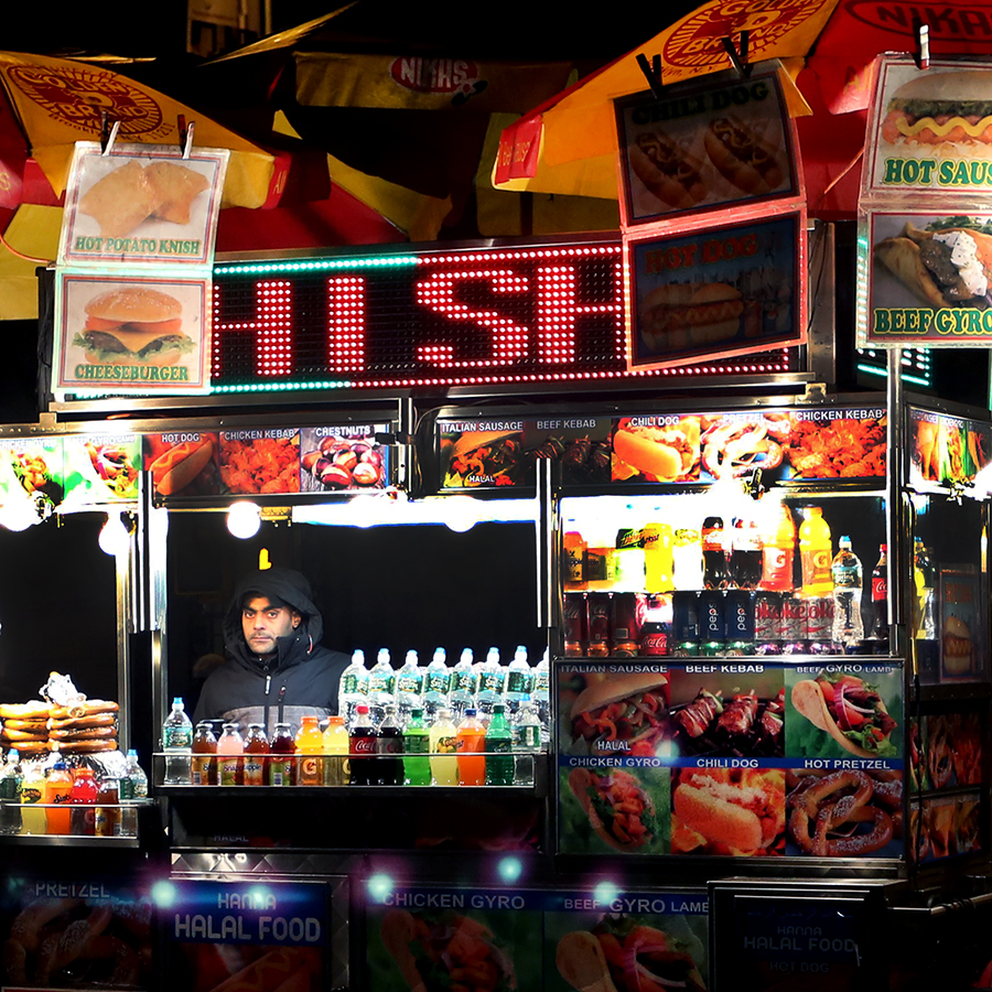
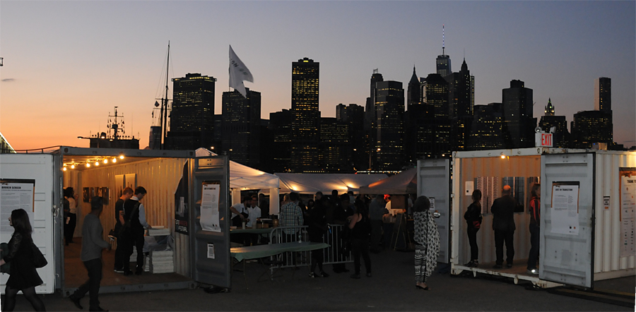
Photoville was amazing last year so I couldn’t wait to go again. This year I took my camera which distracted me a little from viewing the photographs. Still at least you get to have a look at the grounds and get an idea of what it means to have a container village exhibiting photographs if you couldn’t make it to Brooklyn.
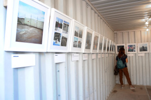
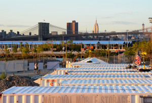
Photoville is based once a year for 2 long weekends during September in Brooklyn Bridge Park. It consists of shipping containers that become galleries. Behind the park is the highway, the two sides stacked on top of each other and above that beautiful carriage houses and cobbled streets. If you look out from Brooklyn you can see the skyline of lower Manhattan across the river, this is the spot to get your sunset panoramas! Through the length of the waterfront park is The Fence,which is a fence (!) featuring juried photographs printed and wrapped along the 1000 foot route. www.photoville.com
On the fence these photographers caught my eye…
Carlotta Cardana with Mod Couples, a bit of Britain that I recognized! http://www.carlottacardana.com/mod-couples/
Dina Liovsky Whiteout http://dinalitovsky.com/whiteout/
Benjamin Rasmussen Afghanistan’s Wakhan Corridor http://benjaminrasmussenphoto.com/#/projects/afghanistans-wakhan-corridor
Vikas Vasudev http://www.vikasvasudev.com/immanence-a-winters-tale/
‘The other’ featured large on the fence although I noticed one juxtaposition between ‘impoverished other’ and ‘partying young Americans’ that effectively strengthened both projects.
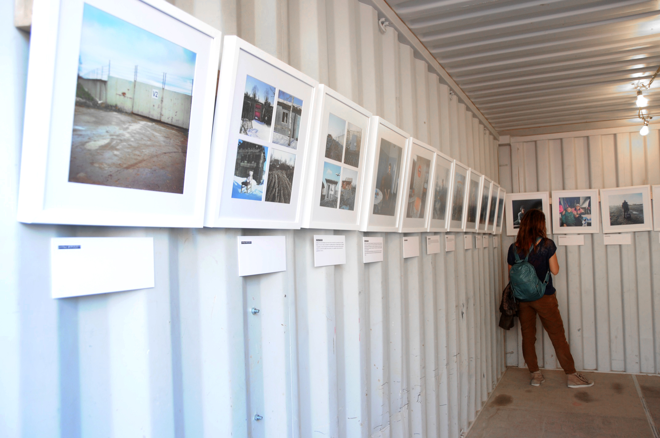
Going inside I got caught up in the presentational aspects. Entering first into Plane Watchers: Evicted in Estonia by Annika Haas, I noticed the white square frames. She had framed her portraits the same way I did the two I had in ‘Interior Lives’. However, whereas my stuck out like a sore thumb against the black or wood frames, Haas’ gave a really clean impression that didn’t hold in or distract from the images. http://www.annikahaas.com/planewatchers/
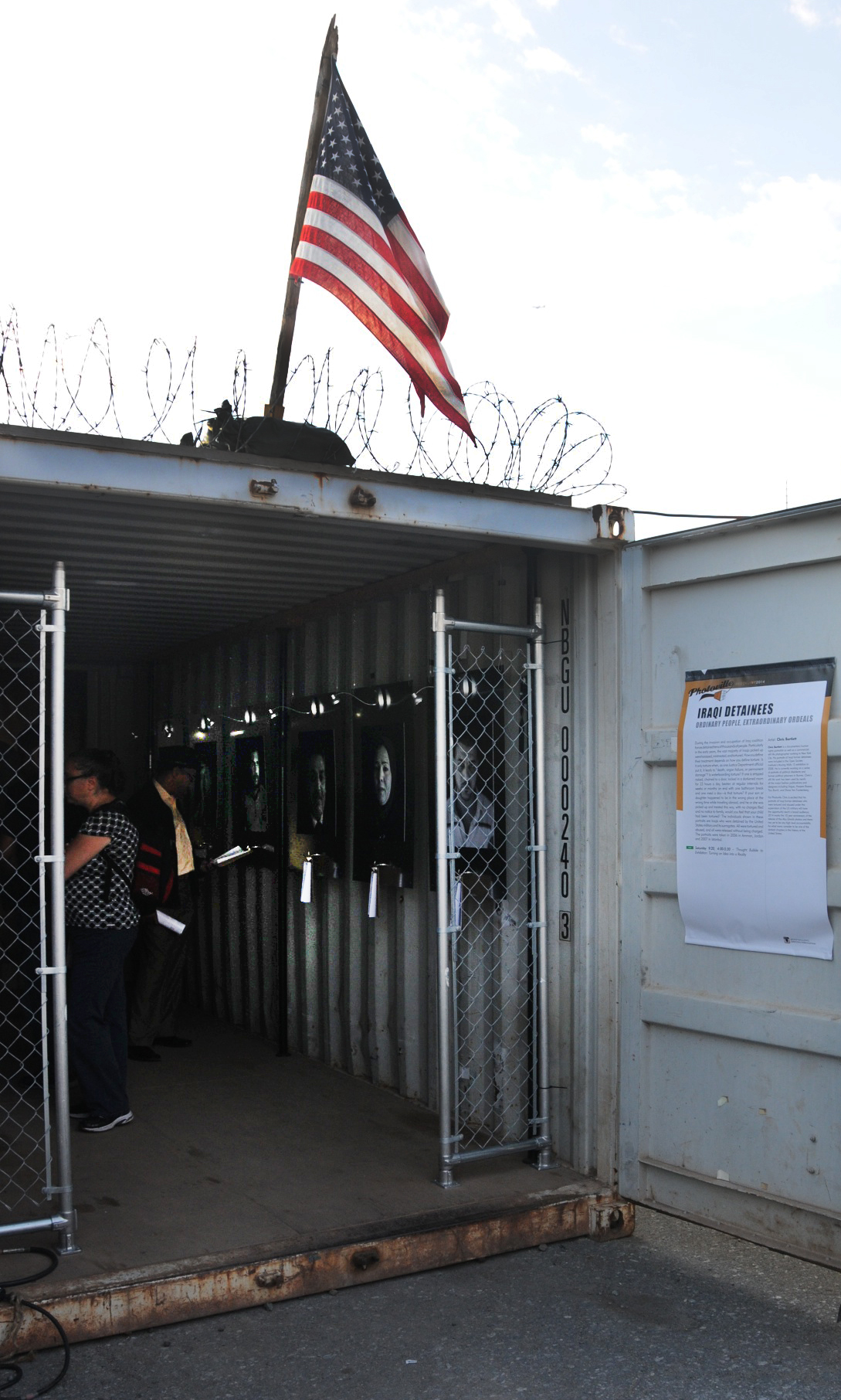
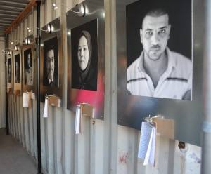
The next container is the one that I found to be an experience. the photographs were by Chris Bartlett for The Detainee Project www.detaineeproject.org
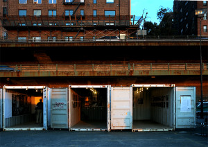
Let me set the scene, from in front of the entrance to the container and from above (the vantage point looking out from two stacked containers.)

Looking carefully you can see the helmets and flag on top of the container and the barbed wire and chain link fence at the entrance to the container. Reading the blurb on the door we are introduced to the fact that many ordinary and innocent Iraqis were caught up, interrogated and tortured by American forces during the Iraq war. Some were interrogated in shipping containers so it is fitting that this exhibition takes place in one.
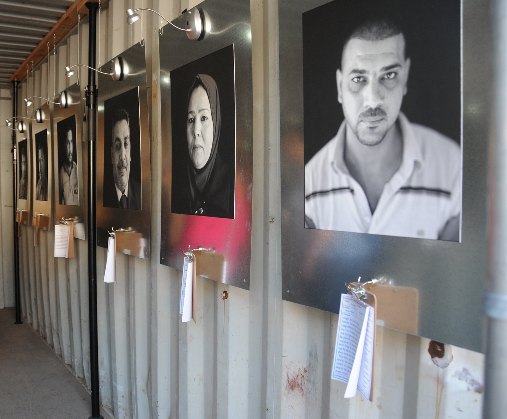
Inside are a series of beautiful black and white, natural light, portraits. All shot with black backgrounds so you are face to face with the eyes of the subject looking right at you.
Each one of these people had been detained, interrogated, tortured and then released without charge. Looking at these photographs though would not give you any indication of this. These portraits were about dignity and reinstated these subjects to their lives as individuals not tortured prisoners.
Each photograph was accompanied by a clip board. (The same one- from Staples- that I had used in my ‘Untitled’ exhibition at Bank Street Arts during the summer). On each was a typed note that told the story of the subject. For example, widowed with five children, a police officer, a cars salesman. Then the torture and abuse was defined in a body of type and boxes ticked for specific infractions such as nudity, bodywork etc.
It was an interesting comparison, the classic portraits in their weighty frames exuding poise and the cheap clipboards with their sordid notes. The Iraqi victims seen here as rising above all those terrible things and their torturers supposedly the good guys looking small and brutal for nothing.
Even the infamous Abu Ghraib pictures, sordid, vulgar and low quality, were abuse. As photographers we often consider that we may be taking advantage of our subjects to benefit ourselves rather than the subject but the Abu Ghraib photographs went beyond that to actually be abusive, another layer of torture and degradation.
This exhibition was not fun, but it was fantastic to see the portraits. Instead of being presented with photographs that compound the victim’s misery by presenting them during their worst suffering Bartlett has allowed us to investigate the treatment of these people with their permission and without the revulsion of capitulating in their degradation as looking at the Abu Ghraib pictures did.
www.chrisbartlettstudio.com/portrait-&-documentary/iraqi-detainee/1/thumbs/
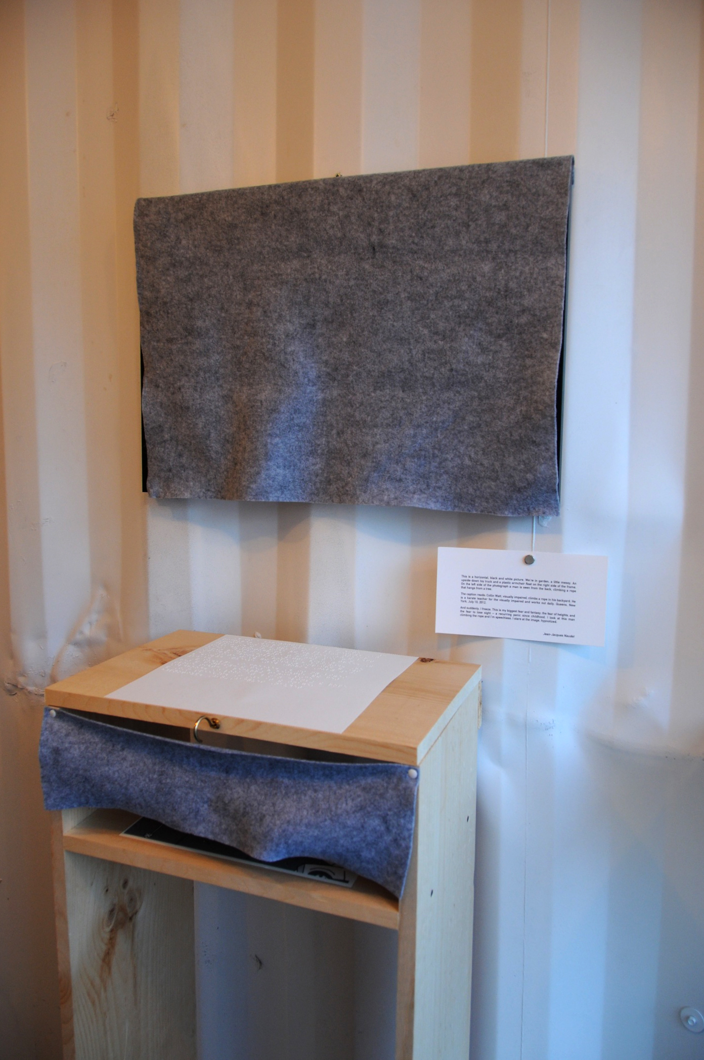
Bartlett’s work set a tone for me, so I skipped over a few of the exhibits. Another one that I found very interesting was Broken Screen by Gaia Squarci and Andrea Cancillieri. Their exhibition was based around the experience of being blind and showed photographs and text and audio interviews. But, as the exhibition was also accessible to the blind and partially sighted the photographs and text were presented slightly differently.

The photograph on the wall was covered. A test next to it gave a written description of what the photograph looked like. On the table in front of the picture the text was again written, but this time in Braille. Underneath the table the photograph was presented in relief so that the image could be felt. I have worked with a partially sighted and bling group at the Whitney Museum of American Art so when I read the description I had a feeling that the photograph would be of the well-known lobby lights, a bank of circles with circular bulbs within them. I felt the image and then took a look. Sure enough there was the group of people in the lobby. It was not so easy, OK nigh on impossible, with the images that didn’t feature places that I was familiar with.
www.gaiasquarci.com/#/broken-screen/broken_screen1
In my love/hate relationship with photographs in series I found Living with Mies by Corine Vermeulen to be cool. Photographing the architecture of Miles van der Rohe in Detroit, we see not a photograph of modernist glamour, empty rooms and cool lines but people’s actual living rooms, actually the same living room floor plan over and over, but each a different home. Fascinating!
http://www.nytimes.com/interactive/2010/10/15/opinion/20101015_Lafayette.html?_r=1&
http://www.corinevermeulen.com
James Nachtwey was presented by Time who has been publishing his work for 30 years. The container had light boxes the whole way round. Nice!
www.jamesnachtwey.com
Finally I was attracted by the view over a Polish beach.The photographer Kacper Kowalski has a website stuffed full of areal photographs- amazing views.
www.Kacperkowalski.pl
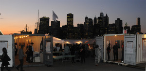
And I’ll leave you with the view of Photoville at sunset.